Mapping Rising Seas

According to U.N. Secretary-General Ban Ki-moon, climate change is “one of the most crucial problems on Earth”. That’s because climate change means more than just rising temperatures and shrinking glaciers. Climate change also means shifts in weather patterns, stronger storms, longer and more severe droughts, changes in the distribution of agricultural pests and diseases, increased wildfire risk, greater ocean acidity, and sea level rise.

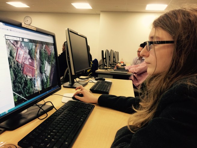
For my semester project, I chose to model sea level rise at Wallops Island, Virginia. I visited Wallops Island in April as part of the STEM Takes Flight Sea Level Rise/Invasive Species Service Learning Course. I will write about that experience in another post.

Wallops Island is a barrier island off Virginia’s Eastern Shore. It is a wildlife refuge and home to NASA’s Wallops Flight Facility, which is NASA’s center for the management and implementation of suborbital research programs. Because of Wallops Island’s location, it is especially vulnerable to sea level rise.

Satellite measurements (NOAA, 2016) show that since 1992, global sea level has been rising at an average of 0.11 inches per year. However, in Virginia’s barrier islands, sea level is rising at twice that rate, an average of about 0.22 inches per year (NOAA, 2016).

When you think of a quarter inch, it really doesn’t seem like very much.Why is this a big deal?

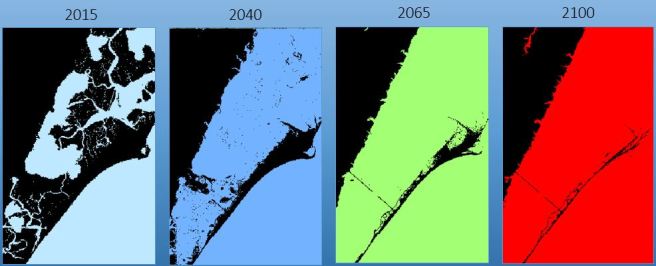
In places like Wallops Island where elevation is close to sea level, small amounts of sea level rise can result in large losses of land. At the current rate of sea level rise, most of the island will be gone by 2040.

Here are some maps I created of land loss on Wallops Island. In this image, land is represented as black and water is represented in color.

Sea Level Rise

Sea level rise is not a new problem for Wallops Island. Land in the Chesapeake Bay area is subsiding or sinking because the Earth is still adjusting to the recession of the glaciers from the last ice age about 12,000 years ago. However, land subsidence increases the rate of relative sea-level rise, and this is why the Virginia coasts have the second highest level of sea level rise in the U.S.

Because of subsidence, the coastline of Wallops Island has moved steadily shorewards from 1851 (earliest data available) to 1962.  However, since 1962, NASA interventions, including a sea wall completed in 2012, have restored much of the shoreline. The 2014 and 2011 coastlines showed the least encroachment because of these interventions.

Even with the sea wall, constant maintenance is required to prevent the beaches from losing 10 to 22 feet of coast to erosion each year.Coastlines

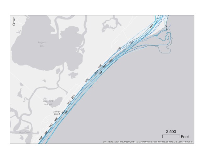
As the Earth warms, rates of sea level rise will increase. It will become harder and more expensive for NASA to counteract the loss of land and protect its facilities.

For a video and more information about sea level rise, Wallops Island, and the methods used in my project,  visit my online story map.


Harmful Algal Blooms – Part 6: Finally, a Project

This semester, I’ve been working with Dr. Kenton Ross, the national science advisor at NASA DEVELOP, to understand the spectral properties of Alexandrium monilatum. I am using aspects of this work as my term project for GIS 295 and GIS 255.

In Harmful Algal Blooms – Part 5: Trouble in Data Land, I discussed the challenge of completing a mapping project when the data has lost its geospatial reference.  However, we were able to obtain approximate locations for each hyperspectral scene by estimating pixel size and lining up the time field in the hyperspectral data  with the time field in the the flight path data set. You can see the scene center lines in black on the image below.

Scene Center lines

The water in this map looks unusual. NDVI is a band ratio index used to indicate vegetation. I used ((Landsat 8 band 5 – band 4)/ (band 5+band 4)) to mask out the land  in ArcGIS. I then clipped out the unmasked water and used false color imagery (bands 6, 5 and 4) to enhance different features of the water.  The water on the right side looks thick and yellow because it is very turbid.

Once I knew where each scene was located, I analyzed each hyperspectral image individually. This is York scene 5.

20150817_YK5

The first thing I noticed was that any detail was hard to see. That’s because one side is in shadow. So, I clipped out the black edges and the bright, overly illuminated right side of the image. I also reduced my number of bands from 283 to 13 carefully selected bands in order to reduce noise and maximize the spectral signal. The resulting image is in the slide below.

Slide7

The deep red swirl is the algal bloom.

I used bands 146 (710 nm), 128 (665 nm) and 85 (559 nm) to create a NIR, red, green false color composite to highlight areas with high chlorophyll.  That’s the second image in the slide.

High chlorophyll should appear red in these images, but the areas of intense blooms appeared bright yellow-green. This is because there is also a red pigment in the blooms that gives them their color.

The third image is estimated chlorophyll. I used the  ratio of band 146 (710 nm) over band 128 (665 nm) as a proxy for chlorophyll-a. Red and yellow indicate high chlorophyll, while dark blue indicates low chlorophyll. You can see that despite the red color, the algal bloom has plenty of chlorophyll.

What about the third image? I used ENVI to run an unsupervised classification. This means that ENVI sorted the pixels in the image into five groups according to their spectral properties. I then used class statistics to obtain the spectral signature of each group. That’s the big image on the left of the slide.

I repeated this procedure on seven images from the York River, four images from the James River, and one image from Mobjack Bay. The signatures in the York River were distinctive enough that we believe we are on the right track to find the spectral signature of Alexandrium monolatum.

For my GIS 295 class project, I created an web app which shows the imagery and spectral signatures at each scene. If you are a member of Northern Virginia Community College GIS group, you can access the app here. Everyone else will have to wait until we are ready to make the app public.

References:

Moses, Wesley J.; Gitelson, Anatoly; Perk, Richard L.; Gurlin, Daniela; Rundquist, Donald C.; Leavitt, Bryan C.; Barrow, Tadd M.; and Brakhage, Paul, “Estimation of chlorophyll-a concentration in turbid productive waters using airborne hyperspectral data” (2012). Papers in Natural Resources. Paper 313. http://digitalcommons.unl.edu/natrespapers/313

Tobler, Steno and Geologic Maps

Waldo Tobler is a geographer at my alma mater, UC Santa Barbara. He is known for Tobler’s Law or the “first law of geography” which states “Everything is related to everything else, but near things are more related to each other than distant things.”

My classmate Sunil Bharuchi recently published a discussion of Tobler’s Law on his blog, GIS 295 Web GIS. He included this image, which explains spatial auto correlation.

Spatial autocorrelation measures how well a set of spatial features and their values are clustered together in space. A spatial feature is a point, line or polygon that identifies the geographic location of a real world object; this object could be a building, a forest, a rock unit or a lake.

According to Tobler’s law, spatial features will be clustered next to more similar spatial features – this is illustrated in the first image above. But, is this always true? Sunil’s post got me thinking.

Here is a geologic map of Yosemite National Park. Which of the images above does it look like?

Map of Yosemite National Park.svg
Map of Yosemite National Park” by General_geologic_map_of_Yosemite_area.png: en:United States Geological Survey derivative work: Grandiose – This file was derived from  General geologic map of Yosemite area.png: . Licensed under CC BY-SA 3.0 via Commons.

I’ve spent years looking at geologic maps, so I told Sunil “image three looks more like geology.” But, does that mean Tobler is wrong?

Not at all.

Nicolas Steno (Niels Stensen, 1638-1686) was a Danish scientist and bishop who made important contributions to the fields of anatomy, paleontology, crystallography and geology. Steno’s principles of statigraphy explain the formation of sedimentary rock and are still used by geologists to determine the history of a rock unit. There are three principles:

  1. The Principle of Superposition: When sediments are deposited, the sediment that is deposited first is at the bottom while sediment that is deposited later is at the top. Therefore, the lower sediments are older.
  2. The Principle of Original Horizontality: Sediment is originally deposited in horizontal layers.
  3. The Principle of Original Continuity: Sediment is deposited in continuous sheets that only stop when they meet an obstacle or taper off because of distance from the source.

Doesn’t the Principle of Original Horizontality sound a lot like Tobler’s Law? Then why don’t geological maps look like the first picture on Sunil’s image?

First of all, sedimentary rock isn’t the only type of rock on Earth.Steno’s principles do not apply to igneous and metamorphic rock.

Second, the Earth is an active planet. Plate tectonics causes sedimentary layers to bend, break and even overturn. Igneous rocks intrude into existing rock from below the Earth’s surface or erupt from above. These processes mean that geologic units are often very complex and the resulting spatial patterns reflect that complexity.

Yosemite USA.JPG
Yosemite USA” by GuyFrancisOwn work. Licensed under CC BY-SA 3.0 via Commons.

James Hutton (1726-1997) was a Scottish physician and geologist who is known as the founder of modern geology. He was the first to suggest that the Earth is continually being formed and that based on the rates of geologic processes, the Earth must be much,much older than the accepted estimate of a few thousand years. He is also known for the Law of Cross-cutting Relationships.

Law of Cross-cutting Relationships: If a fault or other body of rock cuts through another body of rock, then that intrusion must be younger in age than the rock that it cuts or displaces.

It is this Law of Cross-cutting Relationships that helps us interpret geological units and create geological maps.

Can you figure out the temporal relationships in this cross section?

geology
From Earth: Portrait of a Planet, 4th Edition (2011) by Stephen Marshak.

So, how does Tobler’s Law fit in? It depends on scale. If you are standing on an outcrop of sandstone, chances are good that the rock surrounding you will also be sandstone – especially if you are in the tectonically quieter center of a continent. But, If you are mapping Yosemite park using one kilometer pixels, you will find a lot more variation in neighboring areas.


Harmful Algal Blooms – Part 5: Trouble in Data Land

If you’ve read Harmful Algal Blooms, Part 4, you know that I had developed a plan to obtain the spectral signature of the Alexandrium monilatum, a toxic dinoflagellate that causes harmful algal blooms in the Chesapeake Bay watershed, from the hyperspectral data that was collected August 17, 2013. I wanted to use spectral signatures to map the extent of harmful algal blooms in the James and York Rivers. However, lots of data doesn’t always mean good data.

The hyperspectral data was collected using a sensor that was mounted on a NASA airplane. The angular cone of visibility detected by a sensor at a given time is called the Instantaneous Field of View (IFOV). The size of the IFOV determines the resolution or minimum size of a pixel.

In this image from Natural Resources Canada, area A is the IFOV and area B is the area on Earth’s surface that that can be seen at a given time (B=A*C).

IFOV2

Area B, the area that can be sensed at any time, depends on many factors, including the altitude of the plane and the angle of the sensor. This illustration from Natural Resources Canada illustrates the effect of angle of view.

IFOV 1


During the August 17 data collection flight, the part of the sensors internal navigation system that measures the plane’s attitude or angle failed. This meant that we could not determine pixel size. It also meant that location data was not available for the hyperspectral data.

GIS stands for Geographic Information Systems. The term “geographic” refers to location.  Without geographic coordinates, we could not accurately place our data on a map. What could we do?

Normally, one would georectify the data using by lining up ground control points. Ground control points are known locations on the ground. they must be small, unchanging and easy to recognize. But, how do you find ground control points in a picture of water?

YK6

Fortunately, we had a .kml file of the flight path, which listed geographic coordinates and times, and a few images with features other than water like this image with a large Navy dock.

20150817_YK7

We were able to use measurements of the dock to calculate pixel size. We calculated the pixels to be about 2 meters long (a long track) and 3 meters wide (across track).

Dr. Kenton Ross, the national science adviser for NASA DEVELOP,  was also able to use time signatures from the flight path file to determine where the plane was at a given time. He matched these times to the time variable of the hyperspectral images and was able to estimate approximate geographic coordinates for each of the images. The seven hyperspectral image sites for the York River are shown below.

Path

However, I still had to give up a big part of my project design. When planning the project, I had forgotten one very important fact: water flows. Unlike ground control points, water does not stay in place over time.

On the image above, you can see a black squiggle. This is the path of the data flow cruise. It overlaps two  of the hyperspectral images shown above in space. However, since the chlorophyll samples were not collected at the exact same time (although it was within a few hours) as the hyperspectral images, the two data sets do not overlap in time. Because there is a time difference, the water moved. This might not make a big difference at 30 meter resolution, but at 2 to 3 meters, it could be a big deal.

There was another problem. The shape file with the locations lost its headers during processing. The ASCII file had to be edited in order to move the locations into ENVI.

Stay tuned for the final post of this series, Harmful Algal Blooms, Part 6, to learn how I (hopefully) resolve these issues and finish my project.

Harmful Algal Blooms – Part 4: What is a Spectral Signature?

The human eye is a light sensor. We can see because the objects around us emit or reflect light at wavelengths that our eyes can detect.

Remote sensing detectors work in the same way. Sunlight is reflected from Earth’s surface. Satellite sensors detect that light and create images. But, satellite and aerial sensors are a lot more sensitive than our eyes.

69904main_RemoteSnsg-fig2

Our eyes can only detect light with wavelengths from about 390 nanometers to 700 nanometers. This range is called visible light and is shown as a rainbow in the NASA image below. But, satellites can detect a much wider range of wavelengths, depending on the sensor. Landsat satellites detect light from visible blue (450 nm)  to the thermal infrared (1251 nm).ems_length_final

All objects reflect, absorb and transmit light. But, some types of materials reflect and absorb certain wavelengths of light in very characteristic ways. So, these types of materials can be distinguished from each other based on the differences in reflectance, or the differences in the pattern of wavelengths that are detected by the sensor. The pattern is called a spectral signature. The following image from NASA shows spectral signatures for some common Earth materials.

(If you click on the picture, it will take you to a NASA site that explains light and remote sensing in more detail.)

spectral-signatures.png

Harmful algal blooms also have spectral signatures. This is the spectral signature of Cochlodinium polykrikoides, one of the species that causes HABs in Virginia (Simon and Shanmugam, 2012).

Cochlodinium

C. polykrikoides is known to absorb light at 555 nanometers and reflect it at 678 nanometers.  These wavelengths correspond to the high and low peaks in the image above.

There is a lot of research about C. polykrikoides, but very little is known about the spectral signature of Alexandrium monilatum. I decided that I would use the hyperspectral data that was collected on our Golden Day of Data Collection, August 17, 2015 to identify blooms of C. polykrikoides and I would try to decode the spectral signature of Alexandrium blooms.

I had a plan. I would map the chlorophyll measurements from the data cruises on the Landsat image to identify the areas with the most chlorophyll. I believed this would correspond to the blooms. I would join these areas to the hyperspectral images in order to obtain spectral signatures. Then, I could map the extent of each bloom.

It was a plan, but you know they say about plans….

Stay tuned for Harmful Algal Blooms Part 5: Trouble in Data Land.


Harmful Algal Blooms – Part 3: A Golden Day of Data Collection

In my post, Harmful Algal Blooms – Part 2, I wrote about the challenges involved in monitoring harmful algal blooms (HABs). I also wrote about working with NASA DEVELOP last summer to develop a method to track harmful algal blooms using remote sensing data. We hoped to develop a tool that would allow HAB researchers to quickly identify algal hotspots.

One of our big challenges was finding dates for which there was both good satellite data and good ground data. We found one such date, July 3, in 2013.

Why only one day? NASA’s MODIS Aqua satellite monitors the Chesapeake Bay on a daily basis. But, Landsat covers the area only once every 16 days. If that day is cloudy, there might be very little overlap between the Landsat and MODIS Aqua images.

Here is a Landsat true color image for Path 13, Row 34 for June 17, 2013 downloaded from USGS’s EarthExplorer website:

LC80140342013168LGN00.jpg

Here is the MODIS image for the same day:

June17

As you can see, having plenty of satellite imagery doesn’t mean that we have good data about conditions in the Chesapeake Bay. And, unfortunately this happens a lot. What we really needed to  complete our project was a Golden Day: a day with clear skies where there was a boat cruise and Landsat coverage in addition to daily MODIS Aqua data. A Golden Day like that would allow us to verify the model.

The “Golden Day of Data Collection” occurred on August 17, 2015. On that day, there was a large bloom of Alexandrium monilatum in the York River and a possible bloom of Cochlodinium polykrikoides on the James River. As Landsat 8 passed above the Alexandrium bloom, the Virginia Institute of Marine Science used a boat to monitor chlorophyll in the water.  You can see the boat path (red squiggle) on the Landsat image below.  StudyArea

The MODIS Aqua imagery for the same day shows high levels of Chlorophyll in the Chesapeake Bay and its tributaries:

Aug17

Since our term with DEVELOP was over, the “Golden Day of Data Collection” didn’t help our project. However, the new team received plenty of information to verify our work. You can learn about their work  here.

Hyperspectral Data

But, the story doesn’t end with good verification data. One of my frustrations with working with Landsat data was that Landsat 8 is multispectral. It’s sensors measure 11 bands of reflectance ranging from 0.43 to 12.51 micrometers. But, these are wide bands and many species of bioluminescent phytoplankton like Alexandrium monilatum and Cochlodinium polykrikoides emit, absorb, and reflect light in very narrow ranges of  wavelengths.

While multispectral sensor bands are wide, hyperspectral sensors divide the same range of wavelengths into dozens, hundreds or even thousands of much thinner slices or bands. This image from Wikipedia explains the concept visually:

MultispectralComparedToHyperspectral

On the Golden Day, a NASA test flight equipped with a hyperspectral sensor passed overhead and obtained hyperspectral imagery of the area. The sensor was able to measure 283 bands of reflectance ranging from .35 to 10.50 micrometers. This means that the sensor could measure the very specific wavelengths I was interested in.

The true color images look like this:

YK6


A pixel in this image is about 2 meters by 3 meters.

Because the images show water from a high altitude, they aren’t at all very exciting too look at. However, having this type data  was very exciting to me. I volunteered to work with the hyperspectral data during the fall term. This work is my project for GIS 255 and GIS 295 and I will describe my project (and the frustrations of working with the hyperspectral data) in future posts.

Go to: Harmful Algal Blooms, Part 4: What is a Spectral Signature?

Tracking Turkeys

It’s a sad day for Meleagris gallopavo, the American wild turkey (also domesticated turkey).  Turkeys all over the U.S. are wearing disguises and hiding today in the hopes that they won’t be the main attraction at the Thanksgiving feast.  So, where are these turkeys hiding?

The BISON (Biodiversity Information Serving Our Nation) database contains occurrence data for millions of species. I decided to see if I could track down those sneaky turkeys. My search returned 324,274 results.

Normally, when I search BISON, I get point data. But, turkeys are so common in the U.S. that I got a heatmap.

turkey

As you can see, the turkeys are hiding in Wisconsin.

My older kids use to make turkey jokes. They seemed to feel that turkeys aren’t highly intelligent birds. But, the decision to hide in Wisconsin shows that turkeys are much smarter than we think.

The current weather map shows that it’s pretty cold in Wisconsin- not cold enough for a turkey to freeze, but cold enough that someone hunting a wild turkey for Thanksgiving dinner would be seriously tempted to give up, go home and drink hot chocolate.

weather map

But, this post isn’t really about clever turkeys or cold weather or even Thanksgiving dinner. It’s definitely not about geology although I think I could probably find a geological reason for turkeys to gather in Wisconsin. It’s about data.

Today data is everywhere. It’s easy to go online and find data for anything from the number of wild turkeys in each state (based on publications, not actual counts) to the weather to each state’s most Googled Thanksgiving dish (according to the New York Times, it is brownberry stuffing  in Wisconsin). It’s just as easy to use the abundance of data to support any argument you feel like making. Today, I’m arguing that turkeys are Packers fan.

football
Most popular football team by state

Source: http://www.businessinsider.com/nfl-teams-popular-by-state-2015-9

Happy Thanksgiving!


11/26 updated to repair image links.


200 Years of Geological Mapping

This is a geologic map of Britain. It is a screen shot of the British Geologic Survey’s “Geology of Britain” viewer.

Brit1

I chose to show bedrock and surface geology because that’s what William Smith showed when he produced the first geologic map of Britain two hundred years ago in 1815.

Unlike many of the English men who made great scientific contributions, William Smith was not nobility – or even well off. He was the son of a farmer. As a young man, he became an apprentice to a surveyor. He eventually went to work for the Somersetshire Coal Canal Company.

While working in the mines, Smith noticed that individual layers of rock on the sides of the pit were  always arranged in the same recognizable relative order. He also noticed that some layers were identifiable by the fossils they contained, and that these fossils were also always in a predictable order.  He was inspired to see if the relationship between the layers of rock or strata, their positions and the fossils they contain was consistent throughout Britain.

As William Smith studied the rocks of England, he drew cross-sections showing relationships and maps showing location. Eventually his work evolved into the first national geologic map. It measured 6 feet by 8.5 feet and showed the rocks of Britain at the a scale of 5 miles per inch.

Smith’s map isn’t so different from the BGS map created using GPS units and satellite data.

627px-Geological_map_Britain_William_Smith_1815
By William Smith (1769-1839) {Public Domain], via Wikimedia Commons

Two hundred years ago, one man created a map by walking through Britain. Since then, geologic maps have been created for every part of the Earth. Thanks to William Smith, mapping is an intergal part of the training of every geologist.

As a geology student, I learned to map in the field by carefully measuring and plotting geologic contacts, folds and faults on a topographic base map.  It wasn’t always easy to distinguish between the greyish-brown of one unit and the brownish-grey of another or determine my location based on map contours. Yet, I eventually learned to make a map that could be interpreted to tell the geologic history of a small area. William Smith didn’t have a topographic base map. How did he do it?

Smith’s map is more than the distribution of rocks. It is a first edition volume of Britain’s geologic history. Since 1815, that volume has been edited and revised hundreds of times, but William Smith is remembered and honored as the original author.

You learn more about William Smith and his maps  and play with an interactive William Smith mapping app here.

Edited some typos (12/7/15)


Mapathon at George Mason University

On Friday, November 20, 11-year-old Arielle and I attended a GIS week map-off at George Mason University. Students from George Mason and Northern Virginia University competed against students from George Washington University while using Open Street Map.

Arielle has attended several mapathons and is quite good with Open Street Map, so we chose the intermediate project. We digitized buildings on imagery from villages in Indonesia that are located near active volcanoes.

I felt it was important that Arielle understand why we are tracing squares on a map. I asked Arielle, “Why does this matter?”. She understood the difference between imagery and maps and that it is important to know what was at a location before a natural disaster in order to estimate damage and direct rescue efforts.

The event was sponsored by Missing Maps, NOVA Community College ASPRS club, George Mason University ASPRS club, Peace Corps, National Geographic, and MapGive.

FullSizeRender.jpg
Are you a better mapper than my 6th grader?


New York: Why the Height of a Skyscraper Depends on Location

Take a look at the New York City skyline. It’s unique and recognizable because of its skyscrapers. New York City is home to some of the tallest buildings in the world.

Suppose you are interested the height of skyscrapers in New York City. You could make a list of building heights, like this list from Wikipedia.

  1. The Freedom Tower, One World Trade Center (1,776 ft.)
  2. 423 Park Avenue (1,400 ft.)
  3. Empire State Building (1,250 ft.)
  4. Bank of America Tower (1,200 ft.)
  5. Chrysler Building (1,046 ft.)
  6. The New York Times Building (1,046 ft.)
  7. One57 (1,005 ft.)
  8. Four World Trade Center (978 ft.)
  9. 70 Pine Street (952 ft.)
  10. The Trump Building, 4o Wall Street (927 ft.)

This list tells me that the Empire State Building is the third tallest building in the City. It tells me that Freedom Tower is about 750 feet taller than the Chrysler Building. But, what does that look like?

I’d get a better idea of what this means with a bar graph. Or. I could use an image like this (also from Wikipedia):

NYCbyPinHt_update
r

This gives me a much better idea of how building heights compare. But, this information is still limited.

What if I want to know where these buildings are? What if I care about their locations? I will need a map.

I used the Building Footprints shapefile from NY OpenData to create this map of buildings with a roof height over 500 feet tall in NYC. Only 177 out of 1,082,433 buildings in NYC are over 500 feet tall. Those buildings are indicated in red.


TallBuildings1

The most interesting thing about this map is that all these very tall buildings are clumped in two locations: Midtown and the Financial District. You can see these clumps in this photograph:

NYCangle2

Here’s a closer look:TallBuilding2.What is going on? Did New York City specifically zone these locations to have tall buildings? Is this meant to preserve the skyline? Or, is it intended to show the importance of the Financial District?
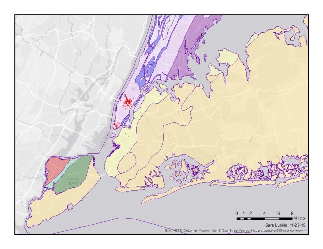
The answers can also be found in a map. The location of New York’s skyscrapers is all about geology. As you can see in my hideously ugly geological map (colors courtesy of USGS’s New York Geological Map downloaded as a shapefile), the island of Manhattan has a different type of surface rock than the surrounding area. This bedrock is a metamorphic rock called the Manhattan schist (in pale lavender).

NYCGeo1

The Manhattan schist formed more than 400 million years ago when a volcanic island arc (similar to today’s Japan) crashed into the eastern side of the continent of Laurentia forming a huge mountain range known as the Taconic Orogeny. The high temperatures and pressures associated with mountain building caused the clay minerals in the mud that accumulated of the coast of Laurentia to transform to more resistant minerals such as biotite, muscovite and quartz.

manhattan schist
Manhattan Schist

Throughout most of Manhattan, this erosion-resistant bedrock is covered with large amounts of unconsolidated sediments. But,  this exceptionally hard rock lies very close to the surface in Downtown and Midtown Manhattan. Because this rock is so strong, it makes the perfect foundation for a skyscraper.

What about other cities? There are only two structures over 500 feet tall in Washington DC: the Hughes Memorial radio tower (761 ft) and the Washington Monument (555 ft). Why doesn’t Washington DC have tall skyscrapers?

While there are some strong metamorphic rocks in Northwest DC, most of DC is built on much softer sedimentary rocks. These rocks cannot support a skyscraper.

So, maps can help us understand where things are, but they can also help us understand why they are where they are. In New York, the height of a building depends on location and location depends on geology.

(Many of the other tallest buildings in the U.S. are located in Chicago. Chicago is weird. You can learn more about the challenges of building skyscrapers in a swamp here. )

This post was inspired by Episode 1 of Making North America on PBS.