Tobler, Steno and Geologic Maps

Waldo Tobler is a geographer at my alma mater, UC Santa Barbara. He is known for Tobler’s Law or the “first law of geography” which states “Everything is related to everything else, but near things are more related to each other than distant things.”

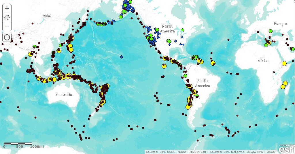
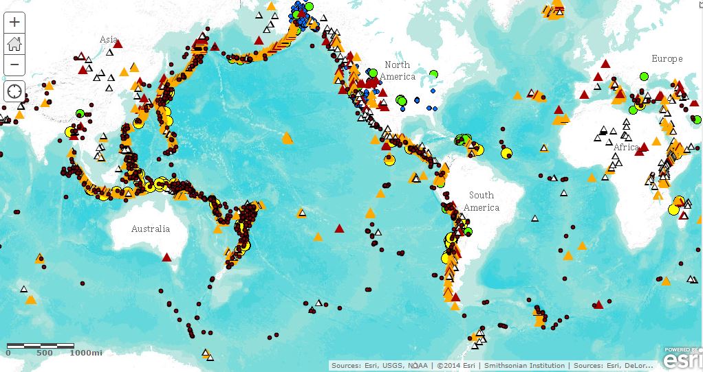
My classmate Sunil Bharuchi recently published a discussion of Tobler’s Law on his blog, GIS 295 Web GIS. He included this image, which explains spatial auto correlation.

Spatial autocorrelation measures how well a set of spatial features and their values are clustered together in space. A spatial feature is a point, line or polygon that identifies the geographic location of a real world object; this object could be a building, a forest, a rock unit or a lake.

According to Tobler’s law, spatial features will be clustered next to more similar spatial features – this is illustrated in the first image above. But, is this always true? Sunil’s post got me thinking.

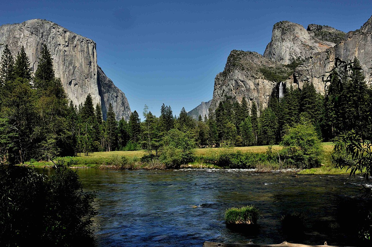
Here is a geologic map of Yosemite National Park. Which of the images above does it look like?

Map of Yosemite National Park.svg
Map of Yosemite National Park” by General_geologic_map_of_Yosemite_area.png: en:United States Geological Survey derivative work: Grandiose – This file was derived from  General geologic map of Yosemite area.png: . Licensed under CC BY-SA 3.0 via Commons.

I’ve spent years looking at geologic maps, so I told Sunil “image three looks more like geology.” But, does that mean Tobler is wrong?

Not at all.

Nicolas Steno (Niels Stensen, 1638-1686) was a Danish scientist and bishop who made important contributions to the fields of anatomy, paleontology, crystallography and geology. Steno’s principles of statigraphy explain the formation of sedimentary rock and are still used by geologists to determine the history of a rock unit. There are three principles:

  1. The Principle of Superposition: When sediments are deposited, the sediment that is deposited first is at the bottom while sediment that is deposited later is at the top. Therefore, the lower sediments are older.
  2. The Principle of Original Horizontality: Sediment is originally deposited in horizontal layers.
  3. The Principle of Original Continuity: Sediment is deposited in continuous sheets that only stop when they meet an obstacle or taper off because of distance from the source.

Doesn’t the Principle of Original Horizontality sound a lot like Tobler’s Law? Then why don’t geological maps look like the first picture on Sunil’s image?

First of all, sedimentary rock isn’t the only type of rock on Earth.Steno’s principles do not apply to igneous and metamorphic rock.

Second, the Earth is an active planet. Plate tectonics causes sedimentary layers to bend, break and even overturn. Igneous rocks intrude into existing rock from below the Earth’s surface or erupt from above. These processes mean that geologic units are often very complex and the resulting spatial patterns reflect that complexity.

Yosemite USA.JPG
Yosemite USA” by GuyFrancisOwn work. Licensed under CC BY-SA 3.0 via Commons.

James Hutton (1726-1997) was a Scottish physician and geologist who is known as the founder of modern geology. He was the first to suggest that the Earth is continually being formed and that based on the rates of geologic processes, the Earth must be much,much older than the accepted estimate of a few thousand years. He is also known for the Law of Cross-cutting Relationships.

Law of Cross-cutting Relationships: If a fault or other body of rock cuts through another body of rock, then that intrusion must be younger in age than the rock that it cuts or displaces.

It is this Law of Cross-cutting Relationships that helps us interpret geological units and create geological maps.

Can you figure out the temporal relationships in this cross section?

geology
From Earth: Portrait of a Planet, 4th Edition (2011) by Stephen Marshak.

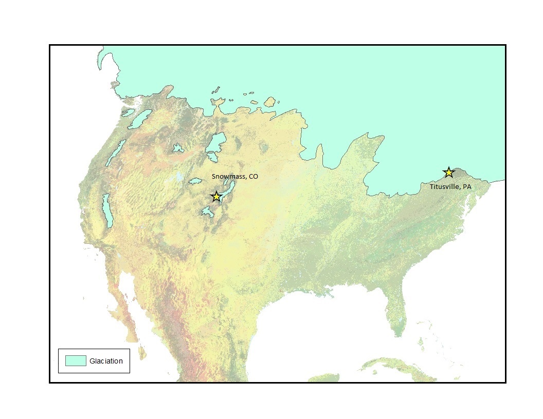
So, how does Tobler’s Law fit in? It depends on scale. If you are standing on an outcrop of sandstone, chances are good that the rock surrounding you will also be sandstone – especially if you are in the tectonically quieter center of a continent. But, If you are mapping Yosemite park using one kilometer pixels, you will find a lot more variation in neighboring areas.


200 Years of Geological Mapping

This is a geologic map of Britain. It is a screen shot of the British Geologic Survey’s “Geology of Britain” viewer.

Brit1

I chose to show bedrock and surface geology because that’s what William Smith showed when he produced the first geologic map of Britain two hundred years ago in 1815.

Unlike many of the English men who made great scientific contributions, William Smith was not nobility – or even well off. He was the son of a farmer. As a young man, he became an apprentice to a surveyor. He eventually went to work for the Somersetshire Coal Canal Company.

While working in the mines, Smith noticed that individual layers of rock on the sides of the pit were  always arranged in the same recognizable relative order. He also noticed that some layers were identifiable by the fossils they contained, and that these fossils were also always in a predictable order.  He was inspired to see if the relationship between the layers of rock or strata, their positions and the fossils they contain was consistent throughout Britain.

As William Smith studied the rocks of England, he drew cross-sections showing relationships and maps showing location. Eventually his work evolved into the first national geologic map. It measured 6 feet by 8.5 feet and showed the rocks of Britain at the a scale of 5 miles per inch.

Smith’s map isn’t so different from the BGS map created using GPS units and satellite data.

627px-Geological_map_Britain_William_Smith_1815
By William Smith (1769-1839) {Public Domain], via Wikimedia Commons

Two hundred years ago, one man created a map by walking through Britain. Since then, geologic maps have been created for every part of the Earth. Thanks to William Smith, mapping is an intergal part of the training of every geologist.

As a geology student, I learned to map in the field by carefully measuring and plotting geologic contacts, folds and faults on a topographic base map.  It wasn’t always easy to distinguish between the greyish-brown of one unit and the brownish-grey of another or determine my location based on map contours. Yet, I eventually learned to make a map that could be interpreted to tell the geologic history of a small area. William Smith didn’t have a topographic base map. How did he do it?

Smith’s map is more than the distribution of rocks. It is a first edition volume of Britain’s geologic history. Since 1815, that volume has been edited and revised hundreds of times, but William Smith is remembered and honored as the original author.

You learn more about William Smith and his maps  and play with an interactive William Smith mapping app here.

Edited some typos (12/7/15)


New York: Why the Height of a Skyscraper Depends on Location

Take a look at the New York City skyline. It’s unique and recognizable because of its skyscrapers. New York City is home to some of the tallest buildings in the world.

Suppose you are interested the height of skyscrapers in New York City. You could make a list of building heights, like this list from Wikipedia.

  1. The Freedom Tower, One World Trade Center (1,776 ft.)
  2. 423 Park Avenue (1,400 ft.)
  3. Empire State Building (1,250 ft.)
  4. Bank of America Tower (1,200 ft.)
  5. Chrysler Building (1,046 ft.)
  6. The New York Times Building (1,046 ft.)
  7. One57 (1,005 ft.)
  8. Four World Trade Center (978 ft.)
  9. 70 Pine Street (952 ft.)
  10. The Trump Building, 4o Wall Street (927 ft.)

This list tells me that the Empire State Building is the third tallest building in the City. It tells me that Freedom Tower is about 750 feet taller than the Chrysler Building. But, what does that look like?

I’d get a better idea of what this means with a bar graph. Or. I could use an image like this (also from Wikipedia):

NYCbyPinHt_update
r

This gives me a much better idea of how building heights compare. But, this information is still limited.

What if I want to know where these buildings are? What if I care about their locations? I will need a map.

I used the Building Footprints shapefile from NY OpenData to create this map of buildings with a roof height over 500 feet tall in NYC. Only 177 out of 1,082,433 buildings in NYC are over 500 feet tall. Those buildings are indicated in red.


TallBuildings1

The most interesting thing about this map is that all these very tall buildings are clumped in two locations: Midtown and the Financial District. You can see these clumps in this photograph:

NYCangle2

Here’s a closer look:TallBuilding2.What is going on? Did New York City specifically zone these locations to have tall buildings? Is this meant to preserve the skyline? Or, is it intended to show the importance of the Financial District?
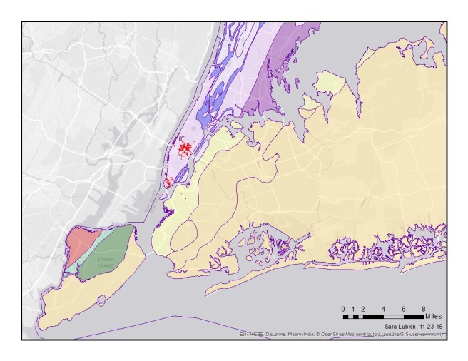
The answers can also be found in a map. The location of New York’s skyscrapers is all about geology. As you can see in my hideously ugly geological map (colors courtesy of USGS’s New York Geological Map downloaded as a shapefile), the island of Manhattan has a different type of surface rock than the surrounding area. This bedrock is a metamorphic rock called the Manhattan schist (in pale lavender).

NYCGeo1

The Manhattan schist formed more than 400 million years ago when a volcanic island arc (similar to today’s Japan) crashed into the eastern side of the continent of Laurentia forming a huge mountain range known as the Taconic Orogeny. The high temperatures and pressures associated with mountain building caused the clay minerals in the mud that accumulated of the coast of Laurentia to transform to more resistant minerals such as biotite, muscovite and quartz.

manhattan schist
Manhattan Schist

Throughout most of Manhattan, this erosion-resistant bedrock is covered with large amounts of unconsolidated sediments. But,  this exceptionally hard rock lies very close to the surface in Downtown and Midtown Manhattan. Because this rock is so strong, it makes the perfect foundation for a skyscraper.

What about other cities? There are only two structures over 500 feet tall in Washington DC: the Hughes Memorial radio tower (761 ft) and the Washington Monument (555 ft). Why doesn’t Washington DC have tall skyscrapers?

While there are some strong metamorphic rocks in Northwest DC, most of DC is built on much softer sedimentary rocks. These rocks cannot support a skyscraper.

So, maps can help us understand where things are, but they can also help us understand why they are where they are. In New York, the height of a building depends on location and location depends on geology.

(Many of the other tallest buildings in the U.S. are located in Chicago. Chicago is weird. You can learn more about the challenges of building skyscrapers in a swamp here. )

This post was inspired by Episode 1 of Making North America on PBS.


Using Beetles to Learn About Past Climates

How many species are there on Earth? Nobody really knows, but one study estimated the number to be about 8.7 million and most of these species are insects.

The largest group of insects are the beetles. Beetles make up about 40% of insects and 30% of animal life. Why are there so many beetles?

Scientists used to believe that beetles had high rates of speciation, but a recent study co-authored by the awesome Dena Smith suggests that beetles might just be really good at avoiding extinction. You can read the paper here.

This resistance to extinction means that many beetle species are very old. Species living now were around millions or even tens of millions of years ago.

Beetle species don’t just live a long time, they are also fussy about where they live. They want the humidity and temperature in their homes to be just right. If it gets too hot or too wet or too cold, they move out and find another home.

Long species durations and specific habitat requirements make fossil beetles very useful for learning about past climates, especially the Pleistocene.

The Pleistocene Epoch is defined as the time period from about 2.6 million years ago to about 11,700 years ago. Like today, the Pleistocene was a period of rapid climate change. During this time there were between 20 and 30 glacial intervals where much of the world’s temperate zones were covered in ice. These glacial intervals were separated by warmer interglacial periods when the ice receded. This map shows the Wisconsinan glaciation 18,000 years ago.Glaciation

I wanted to see if I could use GIS techniques to reconstruct Pleistocene climate using fossil beetles.  I chose two sites for my study: The Titusville Peat in Pennsylvania and Ziegler Reservoir near Snowmass, Colorado. The Titusville site is an ancient peat bog during the mid-Wisconsinan interstadial between 43.5 and 39 thousand years ago (Elias, 1999).

Ziegler Reservoir is located near Snowmass Village, a ski resort in Colorado. In 2010, work began to widen the reservoir, but the remains of a mammoth were uncovered, leading to a paleontological excavation. Numerous mastodons, mammoths, ground sloths, bison and camels as well as insects were recovered from the site. Carbon dating indicates the age of the site ranges from 126 to 77 thousand years old (Elias, 2014).Sites

I obtained the list of species for Titusville from the Paleobiology database and the species from Snowmass from Elias’s 2014 paper about the site.

I looked up species ranges using Global Biodiversity Information Facility (GBIF) and USGS’s Biodiversity Information Serving Our Nation (BISON) databases. These are sites that list museum specimens. Each record includes the longitude and latitude where the specimen was collected.

To determine climate preferences, I used two sources: The global ecological land unit map and Koppen Geiger climate zones

The global ecological land unit map was developed by esri and the USGS. It is a 250 m resolution raster containing information about bioclimate, landcover, lithology, and landforms. Here are my fossil insect species on top of the global ELU map.GlobalEco

The Koppen-Geiger climate classification was first developed in 1884. It has been revised several times, but remains the most widely used climate classification system. The system divides Earth climates into 30 zones with unique temperature, moisture and weather properties.

KGZone

I used GIS a sequence of spatial joins to connect the ecological and climate data to species. I learned that 43.5- 39,000 years ago, when the Titusville Peat was deposited, Titusville was in Köppen Geiger zone Dfc, which subarctic with cool summer, wet all year. This means that winter temperatures were as low as -40 C (-40F) and summer temperatures as high as 30 C (86F) — much cooler than current climate zone Dfb (humid continental). The bioclimate was cold and wet and the dominant vegetation included needle leaf /evergreen forests.

The Snowmass data was more complicated because it represents almost 50,000 years and the site is on a mountain. On mountains, wind picks up flying insects from warmer, lower elevations and carries them to cooler, higher elevations in a process called orographic lifting.

To compensate for the long time period and the effects of orographic lifting, I divided the beetle assemblage into five time intervals and I removed all the flying beetles from the analysis.

The climate at the Snowmass site was initially similar to today’s climate. Insects suggest Koppen-Geiger Zone Dfc, subarctic with a cool summer.Over the next 2-3 intervals, the climate gradually cooled from Zone Dfc to to zone ET (tundra with no warm season). By the 4th interval, all insects indicated Koppen Geiger zone ET or tundra. But, in the last interval, the prevalence of insects from Zone Dfc indicates warming. As in Titusville, the bioclimate was cold and wet and the dominant vegetation included needle leaf /evergreen forests.

You can see the modern distribution of Dfc and ET in this map.SubArcticTundra

Using insects to model past ecosystems isn’t a new idea. But, as far as I know, no one else has used GIS to join insects to specific ecological variables for climate reconstruction. I will be presenting the more scientific version of this research at the Geological Society of America Annual Meeting in Baltimore on Tuesday, November 3.

All Maps are Not Created Equal: Blogging About Maps

The assignment is to identify two web maps and two static maps and determine the appropriateness of the medium for internet use.

Geological maps often start as topographic maps.  Topographic maps are available for download from the USGS. There is a fee for most of the maps.

My Geology 111 students use the Fredericksburg quadrangle to practice their map skills. That map can be viewed here. You can see in the image below, that this is not an ideal map for the web.

There is a lot of detail on this map, but I can’t see that detail on my monitor. The contours are barely visible. I ask my students to count contours to estimate change in elevation. This would be impossible if they had to do it on a laptop screen.

fredericksburgquad

When I was a student, I used topographic maps to make geologic maps – maps that show rock units. This is an image of a paper geologic map of Virginia stolen from VirginiaPlaces.org.

geologyva

I can see the entire map on my laptop screen. I can interpret and understand the information. But, it could be much, much better.

The USGS has created an interactive geological map of the U.S. With this map, it is possible to zoom in to a state or county and see the geology of an area in increasing detail. This is the Fredericksburg area. I was able to add County names and information from Google Earth, so I could determine where the rocks are located. fburggeo

This is great and very easy to use, but it only shows one type of information. What if I want to know about rocks and climate? One of the benefits of using a computer to view maps is that multiple types of information can be stored and viewed on one map.

The USGS and esri worked together to create the “Ecological Tapestry of the World“. This interactive map shows rock type, but it also shows bioclimates, landforms,and land cover – all at a 250 meter resolution.

Here’s Fredericksburg.ecomap

The information is also available as a layer in ArcGIS online.

Happy National Earth Science Week!

This week is National Earth Science Week. Earth Science Week. Earth Science Week occurs during the second full week of October and is organized by the American Geosciences Institute.  Each day of the week also has a theme.

There is also an overall theme for the week. This year’s theme is “Visualizing Earth Systems“. The website is full of information and fun things to look at. There links in the left sidebar to maps, models, and remote sensing images showing climate, energy, natural hazards, minerals, water and other Earth science topics.

Enjoy these resources! And, Happy Earth Science Week.

World_geologic_provinces
Geologic Provinces of the World https://commons.wikimedia.org/wiki/Atlas_of_the_World/Geological

On Shaky Ground 2: How Earthquakes Teach Us About Geology

My first earthquake was the Loma Prieta earthquake on October 17, 1989. The 6.9 magnitude earthquake is also known as the World Series Quake because  millions saw the earthquake live on TV as they watched Game 3 at Candlestick Park.

The epicenter of the earthquake was located about 10 miles northeast of Santa Cruz on the Loma Prieta segment of the San Andreas fault system. I was on a commuter bus in Berkeley at the time; I didn’t feel a thing. But, many other people did.

More than 200 buildings were damaged in San Francisco’s Marina District. Forty-two people died when the upper level Cypress Street off-ramp of the Nimitz Freeway collapsed into the lower dock. Hundreds of Oakland residents were displaced when the buildings they lived in or worked in were closed because of structural damage.

Earthquakes are destructive. They cause property damage, injuries and loss of life. But, we can also learn a lot from earthquakes.

Earthquakes are caused by the interactions of tectonic plates. They generally occur at the boundaries where two or more plates meet. We can identify plate boundaries by mapping large amounts of earthquakes.

In this map, strong earthquakes from 2012-2014 are shown in red. Earthquakes from the last week are also shown.plateboundariesYou can see that most earthquakes occur in distinct bands. These bands outline the boundaries of Earth’s tectonic plates. The discovery that earthquakes occur in bands actually contributed to the idea of plate tectonics.

My students learn that there are three types of plate boundaries: divergent boundaries where plates move apart and new crust is formed; convergent boundaries where plates move together and oceanic crust is subducted or pushed down into the mantle; and, transform boundaries where plates move past each other. We can use earthquakes and volcanoes to determine the type of boundary at a map location.

When I added the Smithsonian Institutions Holocene volcanoes layer to the map, it looks like this. volcanoesThe yellow volcanoes are volcanoes that have been active over the last 10,000 years. As you can see, most of these volcanoes occur in the same area as earthquakes. There are some exceptions.

Volcanoes that occur far from plate boundaries are “hot spot” volcanoes. These form when crust travels over a mantle plume, an area in the mantle that is extra hot. Hawaii is a chain of hot spot volcanoes.Hawaii

There are also places where there are earthquakes an no volcanoes. The coast of California is one of those places.

CA

In California, the San Andreas fault marks a transform boundary where the Pacific Plate is moving past the North American plate. Volcanoes only occur at divergent and convergent boundaries. The volcanoes to the east are extinct leftovers from Basin-Range rifting (divergent boundary).

We can use earthquake depth to determine if a map boundary is convergent or divergent. In this map, depth is shown by the size of the circle. Deeper earthquakes appear larger.

deep

Shallow earthquakes (less than 75 km deep) often occur at mid-ocean ridges. These are long chains of underwater volcanoes where tectonic plates move apart and new crust is formed. Deep earthquakes occur at subduction zones where oceanic crust is being pushed under continental crust.

Oceanic-continental_convergence_Fig21oceancont

When this occurs, the subducting plate bumps and scrapes against the overriding plate. This causes deep earthquakes. When the subducting material reaches a depth of about 660 km, the rock becomes soft enough to flow and earthquakes stop.

Non-map images are from Creative Commons (Wikipedia). My map can be found here.

On Shaky Ground Part 1: Earthquakes in Virginia

It’s been just over four years since a 5.8 magnitude earthquake in the Central Virginia Seismic Zone damaged the Washington Monument. That was a significant earthquake for our area.

Last Sunday (9/27/15) the Central Virginia Seismic Zone experienced another earthquake.  The magnitude 2.0 quake was one of hundreds of small earthquakes that have occurred in the area over the past four years. And, InsideNova feels the need to report every single one.

So, is Virginia really a seismically active area? I placed esri’s USA Earthquake Risk map on top of a topographic base map. The map shows potential ground shaking intensity from earthquakes, an estimate of the amount of damage an earthquake is likely to cause in an area.  I set the scale so the highest risk in shown in dark red while the lowest risk appears as dark blue. I added the past week’s worth of earthquakes (from esri Disater Response) to the map. You can see the our 2.0 quake in Central Virginia.

Seismic zones

Moost of Virginia falls in the medium blue range indicating a very low risk of damage from earthquakes. Our recent earthquake is small compared to the many of the other earthquakes that occurred in the U.S. last week.

It’s not surprising that the West Coast of the United States is covered in red and orange. The California, Oregon, and Washington coasts are active margins. This means that the edge of the continent coincides with the edges of one or more tectonic plates (in this case: North American, Juan de Fuca, Pacific). Geologic activity such as earthquakes and volcanoes generally occurs at the edges of tectonic plates.

The East Coast is a passive margin. The eastern edge of the North American tectonic plate is far out in the Atlantic ocean. So, geologic activity on the East Coast and most of the U.S. is relatively rare as indicated by the blue coloring.

Behind California is an area known as the Basin Range province. This is the remnant of an ancient rift zone. In the early Miocene (about 17 ma), the North American continent began to stretch and thin. But, before the continent could rift into two tectonic plates, seismic activity stopped. This left a network of faults which still responds to the stresses from activity on the West Coast. The New Madrid fault zone which underlies Alabama, Arkansas, Illinois, Indiana, Kansas, Kentucky, Mississippi, Missouri, Oklahoma, Tennessee and Texas is another example of an ancient rift zone.

But, not all rift zones are ancient. The red area in Northern New York and New Hampshire indicates activity from the St. Lawrence rift system, an active rift zone that runs along the St. Lawrence River. Perhaps one day, North America will split and a new Canadian plate will form.

If you are looking carefully you might notice that there are medium blue areas in the middle of continents far from any plate boundaries that have recently experienced larger earthquakes. Is that rifting? Does that mean we should worry?

No, it’s not rifting, but we may have reasons to worry. The cluster of earthquakes in Oklahoma includes several with a magnitude between 2.0 and 3.0. These small earthquakes have been linked to fracking rather than seismic activity. The 3.2 earthquake near Stamford, NY may also be caused by human activity. It is likely the result of water pressure from the Gilboa Dam.

Like Oklahoma and New York, Virginia has networks of ancient faults that can be reactivated by human activity. However, seismologists believe that most of our earthquakes are simply the result of old faults moving because of sea floor spreading in the Atlantic Ocean.

You can view my map here.

Introductions

Hi, I’m Sara Lubkin. I am a GIS certificate student at Northern Virginia Community College.

I am also a geologist who studies fossil insects, paleoclimate and the current effects of climate change. I earned my PhD from Cornell University in 2008 and worked in web and social media marketing for a while.

I now teach introductory geology classes at the University of Mary Washington. When I’m not teaching or learning, I do research. I am currently collaborating with the NASA DEVELOP Program and the Virginia Institute of Marine Science on a project tracking harmful algal blooms (HAB) in the Chesapeake Bay. I am also a mom.

For me, GIS is connecting data to geography. When non-scientists ask me what GIS is, I tell them that I put information on maps so I can better analyze and interpret.  I was a scientist before I studied GIS, but GIS has allowed me to ask and answer different types of questions.

Before studying GIS, my fossil insect research focused on describing new species and determining how species were related to other species and modern species. I was getting frustrated with this work and wanted to do something more meaningful. Now, I am able to connect Pleistocene fossil insect species to specific climate zones and create maps of Pleistocene glaciation. I am hoping to use this research and my work with NASA DEVELOP to transition into the study of climate change and its effects on the Earth.