Geology Matters: Watersheds in Fairfax County

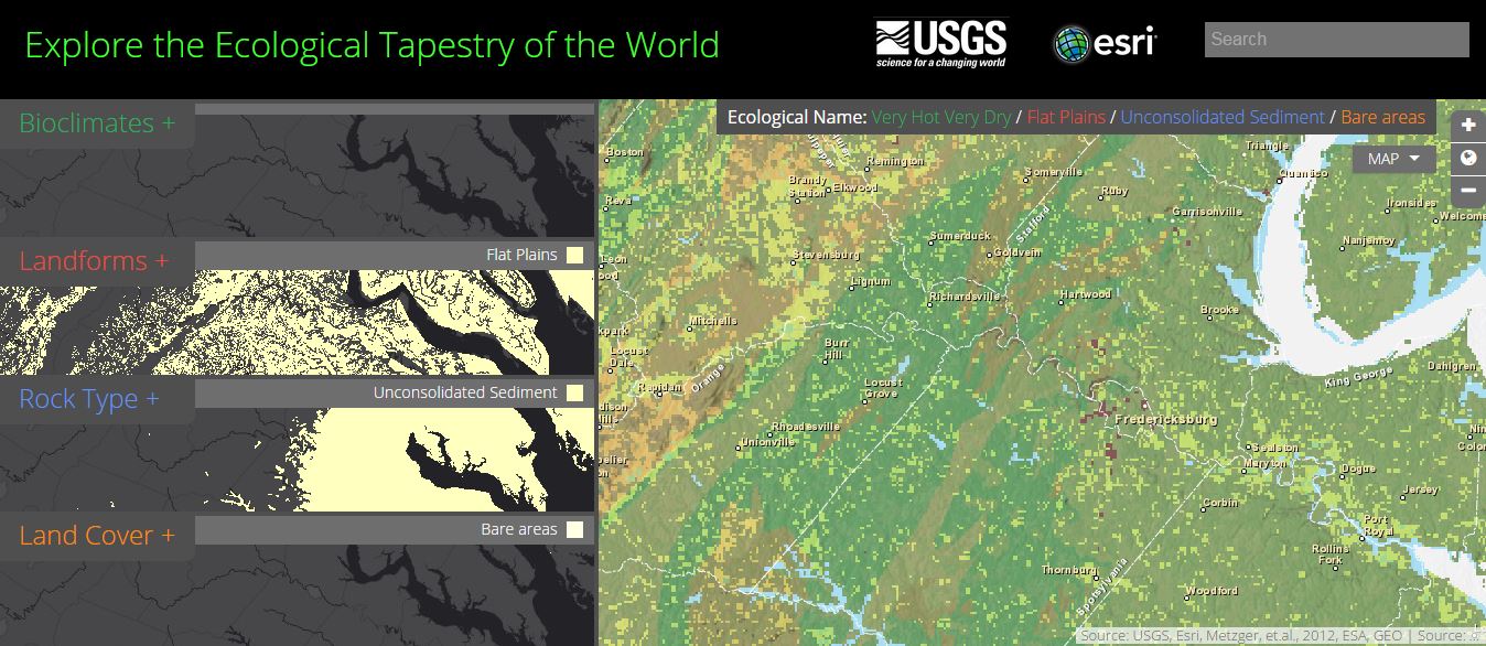
On November, 11th, Greg Bacon, an analyst at Fairfax County GIS, came to talk to the GIS 295 class about his work and the data available online at the Fairfax County Geoportal website.

The website contains information about public services, land records, land development, transportation (a big deal in Northern Virginia), safety, amenities, elections, and wildlife – basically, all the county information that your average citizen or business might need. At the very very bottom of the page, you will find watersheds.

FXWatersheds

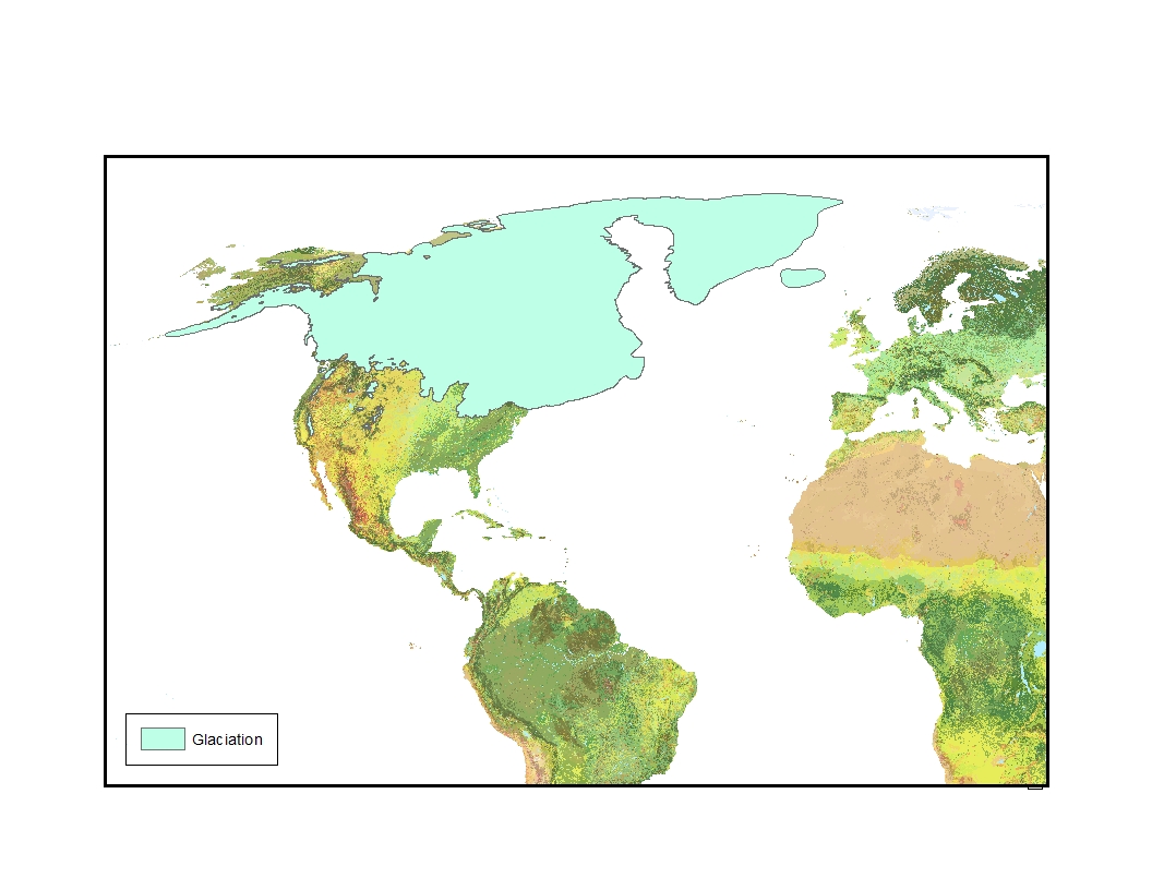
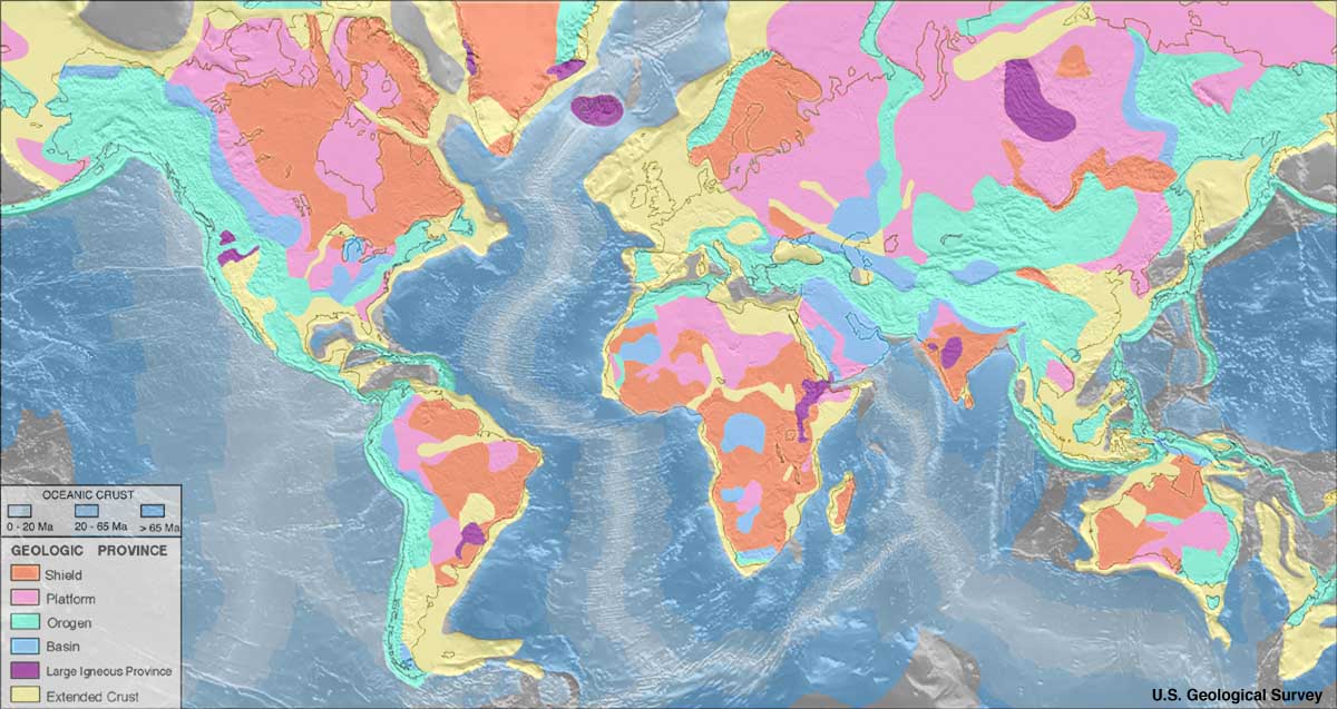
A watershed is all of the land that drains into a particular body of water. Watersheds occur at all scales. The United States is divided into two great watersheds by the Continental Divide, a line of high peaks stretching from the Andes through the Rockies that divides land that drains into the Pacific Ocean from land that drains into the Atlantic Ocean. You can see the continental divide on the map below.continental divide

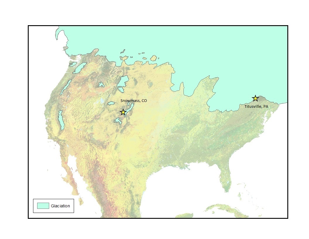
The Rocky Mountains of the U.S. formed through a series of continental plate collisions. The most recent is the Laramide Orogeny that occurred between 80 and 55 million years ago. At that time, the Rockies were about 6,000 meters above sea level.  Today, the highest peak is Mount Elbert at 4,401 meters.

While the Continental Divide determines which ocean water ultimately ends up in, there are many ways for water to get to those oceans. The U.S. Geological Survey (USGS) uses hydrologic unit codes (HUC) at six different scales (2,4,6,8,10,12) to designate the area of land that uses a particular water body as a path to the ocean. In this map, you can see HUC 2 or regional divisions. Unlike other watershed models, the USGS’s model is based entirely on water drainage – not state or local administrative boundaries.

HUC2 Fairfax County is in the HUC 2-02 watershed boundary, or mid-Atlantic region.  If I zoom in, I can see that Fairfax County is also in HUC 4-207.  Drainage in this region flows into the Potomac River. If Fairfax County was further north, water would flow into the Susquehanna. If it were further South, water would flow into the lower Chesapeake. The upper Chesapeake watershed is to the east.huc4

At the HUC 6 level, most of Fairfax flows into the Middle Potomac. However, the rivers used to  get to the mid-Potomac differ. That causes the area to be divided into the Anacostia-Occoquan and the Catoctin district (northwest).

The area continues to be subdivided until the HUD 12 level which is based on local creeks and lakes – a resolution that is very similar to the Fairfax County dataset. The Fairfax County system continues to subdivide regions to the level of individual creeks and streams, but one must click at the “more info” tab on the mapped watersheds to learn about these subdivisions.

HUC12

There is one important difference between the Fairfax County watershed designations and the USGS system. The Fairfax County watershed boundaries end at the county line. The USGS boundaries do not. That is because the USGS watersheds are based on geology. The Fairfax County watersheds are based on administrative boundaries.

I looked up the Cob Run and Bull Run watersheds on the Fairfax County website. This area is located in southwestern Fairfax County between Loudon and Prince William Counties and covers 64 miles of land that drain into tributaries of the Occoquan Reservoir.  The website says that 14 square miles in Loudon County also drains into this watershed.  This matters.

We all need clean water. Yet, the conveniences of everyday life (manufacturing, transportation, agriculture) create pollution that is carried into our drinking water. In Fairfax County, all drinking water comes from the Potomac or the Occoquan.

All water that falls or accumulates in a river’s watershed goes into that river. This includes the rain that falls on the roads and mixes with the oil and gas that cars leave behind It includes chemical-laden runoff from industry and farms. It even includes the water that washed off your neighbor’s yard after he sprayed his azaleas. Although, this water is cleaned and treated, small “safe” amounts of contaminants remain.

Fairfax County, like all counties, must consider water pollution when planning for the future. The County must answer questions like “How will expanding Route 28 increase runoff into Bull Run?”,  “How much of that water will end up in our drinking supply?”, and “How will that water be treated?” What happens when Manassas doesn’t care because commuters are sick of sitting in traffic and the creek is across a county line? Or, when an administrator uses the map without reading the metadata? Wouldn’t it be better to stick with the USGS system which is based on the way the Earth actually works and then figure out the overlap?

As a geologist, I know that a watershed is all of the land that drains into a particular body of water.  I’m uncomfortable with the Fairfax County map; anyone want to offer reassurance?

Harmful Algal Blooms – Part 2: Monitoring Harmful Algal Blooms

In Harmful Algal Blooms – Part 1, I discussed what a harmful algal bloom is and why we care about blooms.  I wrote about the dangers that HABs pose to public health and the economy and explained why it is important to monitor and study HABs.

Members of the Virginia Harmful Algal Bloom Task Force use a combination of fixed stations, continuous sampling, and periodic dataflow cruises to monitor water quality in the Chesapeake Bay watershed. This map shows monitoring stations in Virginia.

Sorce: Virginia Institute of Marine Science

Data for each of these stations is available at the Virginia Estuarine and Coastal Observing System (VECOS) website.  It looks as if Virginia’s rivers are well-covered, but if you go to the site and take a look at this data, you will notice that many of these sites are no longer active due to funding cuts.

Current monitoring consists of fixed stations and periodic dataflow cruises operated by the Virginia Institute of Marine Science and Old Dominion University. Most of this monitoring focuses on the James River and the York River. Sanitation districts, like the Hampton Roads Sanitation District, do automated continuous sampling in their service areas. This monitoring is on-going, but it doesn’t provide a complete picture of HAB activity.

The first obstacle is that processing all these samples takes time. Harmful algal bloom species have to be separated out of water samples that contain hundreds or thousands of other microorganisms through a complex series of DNA tests. Information isn’t available until weeks or months after a bloom occurs. By then, it may be too late to determine what factors contributed to the bloom.

The second problem is that using dataflow cruises for real-time monitoring is expensive. So, boat cruises are restricted to areas of high concern. This means that blooms in other parts of the Chesapeake Bay watershed may be overlooked.

This makes it difficult to get the environmental and water quality information needed to understand and predict HAB occurrences. It also makes it difficult to get real time information about HAB activity in the Chesapeake Bay watershed.

What if there was a less expensive option?

Last summer, I participated in the NASA DEVELOP program at the Patrick Henry Building in Richmond. Our team, Cassandra Morgan and I, worked on a method to monitor harmful algal blooms using satellite data.

Sara Lubkin (NASA DEVELOP), Todd Egerton (ODU), Wolfgang Vgelbein (VIMS), Kimberly Reece (VIMS), Cassandra Morgan (NASA DEVELOP)

Satellites can take pictures of HABs like this Landsat 8 true color image.

study_area_81715
Landsat 8 08/17/2015

While, you can see the bloom in this picture, it’s hard to determine exactly which areas are in the bloom. However, phytoplankton uses chlorophyll-A to harvest the energy of the sun. VIMS and ODU detect harmful algal blooms by measuring levels of chlorophyll-A. What if we could detect chlorophyll-A in the water using remote sensing? We could then use chlorophyll measurements as a proxy for HABs.

NASA’s MODIS Aqua satellite collects information about water, including chlorophyll-A levels. Chlorophyll-A maps are available at no charge from NOAA CoastWatch’s East Coast Node.

This is a MODIS chlorophyll map for the same day.MODIS

You can see that there are high levels of chlorophyll in the James River, Upper Chesapeake, Potomac and Mobjack Bay.

The problem is that MODIs aqua chlorophyll products have a 1.4 kilometer resolution. So, they don’t give a lot of detail – especially in narrow rivers like the York.

Landsat 8 has a 30 meter resolution. But, there are no publicly available Landsat chlorophyll-A products. It was Cassandra and my job to create this product.

We started by  downloading Landsat 8 images (Path 14, Row 34) from May through September 2011-2014. We looked for images without too much cloud cover. We masked out the land and the clouds and  filtered these images through a 1.4 km moving window to match the MODIS resolution. We chose the day with the best overlap between MODIS and Landsat and joined MODIS the chlorophyll-a values to each smoothed, masked Landsat band. We also added bathymetric measurements

Once we had this data in one table, we were able to export it to “R” and run a series of regressions. We tested 78 separate equations. The best five equations were used to create tools using ArcGIS model builder (r-squared values .57 to .62). Here is an image of chlorophyll in the Bay created with one of those tools.ChlJuly3

We were now able to show chlorophyll-A estimates at 30 meter resolution.

Cassandra and I created a preliminary model for chlorophyll-A during our summer term. This term, NASA DEVOLOP teams at Langley Research Center and Wise County are testing the model on additional dates and validating the equations using VECOS water quality data. They are also creating easy-to-use ArcGIS tools that will allow VIMS and ODU to quickly assess the extent of algal blooms in the Chesapeake Bay.

These tools will save time and money by allowing VIMS and ODU to better target their monitoring efforts. The tools will also allow researchers to collect information about environmental factors associated with HABs.

To learn more about NASA DEVELOP and this project, check out our video or our story map.

Next Week: Harmful Algal Blooms – Part 3: The Golden Day of Data Collection

Harmful Algal Blooms – Part 1: Who Cares About Harmful Algal Blooms?

It’s a beautiful day in Virginia. The sun is shining, the birds are singing and the water is a beautiful shade of brownish green…

Harmful Algal Bloom
Source: Chesapeake Bay Foundation

The “lovely” color of the water is a harmful algal bloom. An algal bloom is an overgrowth of phytoplankton –  tiny, photosynthetic organisms that live in the water. A harmful algal bloom or HAB is an algal bloom that has some kind of negative effect on other organisms.

In Virginia, harmful algal blooms occur between May and September when the water is warm and full of nutrients like phosphorous and nitrogen – the same nutrients used to fertilize plants. Some of these nutrients come from industry and sewage treatment, but many nutrients are washed into the water when rain falls on farms and yards.  Warm, wet summers are great for plants and for harmful algal blooms.

Algal blooms discolor the water and produce noxious odors. They also block the sunlight that is needed by underwater plants and keep filter feeders like oyster from being able to obtain food. When the phytoplankton die and decompose, they remove large quantities of dissolved oxygen from the water and create anoxic dead zones. The result is massive fish kills because fish, oysters, clams, crabs, and other organisms can’t get the oxygen they need.

Source: Chesapeake Bay Foundaton
Source: Chesapeake Bay Foundation

Scientists in Virginia are especially concerned about two species: Cochlodinium polykrikoides and Alexandrium monilatum. Cochlodinium polykrikoides is native to Virginia. Alexandrium monilatum is an invasive species that wasn’t found north of Florida until 2007. It now occurs regularly in Virginia’s rivers.

Both these species produce red tides, like the bloom in the picture below. They also produce toxins that can kill fish and cause birth defects in shellfish. These toxins may also cause illness in humans.

Image from Virginia Institute of Marine Science (VIMS)
Source: Virginia Institute of Marine Science (VIMS)

HABs are a public health problem. They are also an economic problem because a large bloom can have a big impact on Virginia’s fishing industry and tourist industry. So, Virginia has a Harmful Algal Bloom Task Force. The task force includes representatives from the Virginia Institute of Marine Science (VIMS), the Marine Resource Commission, the Department of Environmental Quality (DEQ), Old Dominion University (ODU) and the Virginia Department of Health. These agencies work together to monitor Virginia’s waters for harmful algal blooms and to respond to bloom events. VIMS and ODU do research on harmful algal bloom species and the biological and environmental conditions that contribute to bloom growth.

HABmap
Virginia Harmful Algal Bloom Surveillance Map 

But, harmful algal blooms aren’t unique to Virginia. Large blooms and dead zones have also been recorded in the Great Lakes, the Gulf of Mexico, the St. Lawrence Estuary, the Oregon Coast, Monterey Bay, the Baltic Sea and Florida. The total economic impact of harmful algal blooms in the U.S. is estimated at $100 million per year.

Last year, Congress reauthorized and expanded the Harmful Algal Blooms and Hypoxia Research and Control Act of 1998. This act provides funding for the study and monitoring of HABs in U.S. waters.

As climate change causes waters to warm, harmful algal blooms are expected to increase in both frequency and severity. More and more water will be affected. So, who cares about harmful algal blooms? We all should care.

Next week: Harmful Algal Blooms – Part 2: Monitoring Harmful Algal Blooms

Edited on 11/20 to add map.

Using Beetles to Learn About Past Climates

How many species are there on Earth? Nobody really knows, but one study estimated the number to be about 8.7 million and most of these species are insects.

The largest group of insects are the beetles. Beetles make up about 40% of insects and 30% of animal life. Why are there so many beetles?

Scientists used to believe that beetles had high rates of speciation, but a recent study co-authored by the awesome Dena Smith suggests that beetles might just be really good at avoiding extinction. You can read the paper here.

This resistance to extinction means that many beetle species are very old. Species living now were around millions or even tens of millions of years ago.

Beetle species don’t just live a long time, they are also fussy about where they live. They want the humidity and temperature in their homes to be just right. If it gets too hot or too wet or too cold, they move out and find another home.

Long species durations and specific habitat requirements make fossil beetles very useful for learning about past climates, especially the Pleistocene.

The Pleistocene Epoch is defined as the time period from about 2.6 million years ago to about 11,700 years ago. Like today, the Pleistocene was a period of rapid climate change. During this time there were between 20 and 30 glacial intervals where much of the world’s temperate zones were covered in ice. These glacial intervals were separated by warmer interglacial periods when the ice receded. This map shows the Wisconsinan glaciation 18,000 years ago.Glaciation

I wanted to see if I could use GIS techniques to reconstruct Pleistocene climate using fossil beetles.  I chose two sites for my study: The Titusville Peat in Pennsylvania and Ziegler Reservoir near Snowmass, Colorado. The Titusville site is an ancient peat bog during the mid-Wisconsinan interstadial between 43.5 and 39 thousand years ago (Elias, 1999).

Ziegler Reservoir is located near Snowmass Village, a ski resort in Colorado. In 2010, work began to widen the reservoir, but the remains of a mammoth were uncovered, leading to a paleontological excavation. Numerous mastodons, mammoths, ground sloths, bison and camels as well as insects were recovered from the site. Carbon dating indicates the age of the site ranges from 126 to 77 thousand years old (Elias, 2014).Sites

I obtained the list of species for Titusville from the Paleobiology database and the species from Snowmass from Elias’s 2014 paper about the site.

I looked up species ranges using Global Biodiversity Information Facility (GBIF) and USGS’s Biodiversity Information Serving Our Nation (BISON) databases. These are sites that list museum specimens. Each record includes the longitude and latitude where the specimen was collected.

To determine climate preferences, I used two sources: The global ecological land unit map and Koppen Geiger climate zones

The global ecological land unit map was developed by esri and the USGS. It is a 250 m resolution raster containing information about bioclimate, landcover, lithology, and landforms. Here are my fossil insect species on top of the global ELU map.GlobalEco

The Koppen-Geiger climate classification was first developed in 1884. It has been revised several times, but remains the most widely used climate classification system. The system divides Earth climates into 30 zones with unique temperature, moisture and weather properties.

KGZone

I used GIS a sequence of spatial joins to connect the ecological and climate data to species. I learned that 43.5- 39,000 years ago, when the Titusville Peat was deposited, Titusville was in Köppen Geiger zone Dfc, which subarctic with cool summer, wet all year. This means that winter temperatures were as low as -40 C (-40F) and summer temperatures as high as 30 C (86F) — much cooler than current climate zone Dfb (humid continental). The bioclimate was cold and wet and the dominant vegetation included needle leaf /evergreen forests.

The Snowmass data was more complicated because it represents almost 50,000 years and the site is on a mountain. On mountains, wind picks up flying insects from warmer, lower elevations and carries them to cooler, higher elevations in a process called orographic lifting.

To compensate for the long time period and the effects of orographic lifting, I divided the beetle assemblage into five time intervals and I removed all the flying beetles from the analysis.

The climate at the Snowmass site was initially similar to today’s climate. Insects suggest Koppen-Geiger Zone Dfc, subarctic with a cool summer.Over the next 2-3 intervals, the climate gradually cooled from Zone Dfc to to zone ET (tundra with no warm season). By the 4th interval, all insects indicated Koppen Geiger zone ET or tundra. But, in the last interval, the prevalence of insects from Zone Dfc indicates warming. As in Titusville, the bioclimate was cold and wet and the dominant vegetation included needle leaf /evergreen forests.

You can see the modern distribution of Dfc and ET in this map.SubArcticTundra

Using insects to model past ecosystems isn’t a new idea. But, as far as I know, no one else has used GIS to join insects to specific ecological variables for climate reconstruction. I will be presenting the more scientific version of this research at the Geological Society of America Annual Meeting in Baltimore on Tuesday, November 3.

How Safe Are You? Mapping Disasters

The assignment is take someone else’s map and modify it. I was assigned Asha Katti’s map of wildfire-prone areas in the U.S.

AshaMap

Here is the link to Asha’s map.

Asha is concerned with how wildfires affect people. The other layers on her map include 2014 USA population density and 2009 USA social vulnerability.

Fires aren’t the only natural disasters that impact American lives. When the 1999 Loma Prieta earthquake struck the Bay Area, I was working at a social service agency in Berkeley. The earthquake left thousands of people homeless and jobless. I learned how easily a person’s life can be disrupted by an unexpected event. But, it doesn’t take an earthquake.

It’s been three years since Hurricane Sandy. The category 2 storm flooded neighborhoods along the East Coast. The worst damage was in New York and New Jersey. And, people are still recovering from Sandy’s effects.

So, I amended the map to show the risk of all natural disasters that have a potential major impact on American lives: volcanoes, earthquakes, hurricanes, tsunamis,n floods, tornadoes and wildfires.  Did I leave anything out? Zombie outbreak?

This is Asha’s fire layer in Northern Virginia, where I live. Although we do have wildfire warning days in the summer, our overall risk of fire is low to very low (green and light green).

(Clicking on any of the maps below should take you to esri’s more interactive map viewer, so you can look at your neighborhood.)

fireva

While I haven’t experienced a wildfire in Virginia, flooding occurs regularly. The area in purple is the 100 year flood zone. This is the area that has a 1 percent chance of flooding in any given year. The yellows show population density.

http://arcg.is/1M13705

Floods in Virginia can be the results of hurricanes. We have a moderately high hurricane risk (orange). This is the same risk as New Jersey.

hurricane

The other severe weather threat that we worry about is tornadoes.

tornadoes

However, we are less likely to have tornadoes in Virginia than in many other parts of the country.

tornadous

What about geological disasters? While we do have earthquakes in Virginia, our overall earthquake risk is very low, especially compared to earthquake risk on the West Coast. On the map, light areas indicate low risk while dark areas indicate high risk.

earthquakesVA

This map of the West Coast shows earthquake and volcanoes. Volcanoes aren’t a risk in Virginia (or most of the United States), but there are active (red) and potentially active (blue) volcanoes in Washington, Oregon and Northern California.  Recent earthquakes are shown as smaller dots. The red markings on the coast are tsunami risk areas.

volcano

A natural disaster can change a life without any warning. So, how safe are you?

After an Earthquake – Tweet

Yesterday (10/15/2015), was the day for Great ShakeOut Earthquake Drills. At 10:15 a.m., I was lecturing about volcanoes, when my slides were replaced with an earthquake drill announcement. I told my students that if an actual earthquake were to happen, they should duck under their desks and stay there until the shaking stopped. Then we went back to volcanoes.

While I was talking about what to do in the event of an earthquake, my children practiced ducking under their desks. Worldwide, more than 22 million people participated in yesterday’s earthquake drills. They learned to drop, cover and hold on. But, they didn’t learn what to do once the shaking stops.

Perhaps one of the most helpful things to do after an earthquake is to tweet about it. USGS seismologist Paul Earle teamed up with USGS computer scientist Michelle Guy to develop a method to use tweets to track and detect earthquakes.

Earle and Guy were able to create a time series algorithm that determined when an earthquake occurred by detecting posts that mentioned earthquakes. This was helpful, but after looking at posts in more detail they noticed two things:

  1. People who were affected by earthquakes kept their initial posts very short.
  2. People who experienced the quake first hand were less likely to share links or discuss the magnitude of the earthquake.

So, the USGS team decided to filter out tweets with more than seven words, tweets with links, and tweets with numbers. They created filters in many languages.

The USGS has about 2,000 earthquake sensors – most are in the United States. The sensors will detect earthquakes, but it can take several minutes or longer for the seismic waves generated by an earthquake to travel through the Earth and reach a sensor. Scientists need several sensor measurements to triangulate an earthquakes epicenter.

Twitter has more than 300 million users per month. Within 30 seconds, tweets about an earthquake can spread around the world. There is little cost for this information as it uses Twitters Public API and open-source software.

While tweets won’t replace sensors and seismometers, they do provide additional information that can be used for emergency response and damage assessment – especially in areas that don’t have a lot of seismometer coverage.

For more information, click here.

To learn about how social media helped provide information after the Nepal earthquake, click here.

Here are several earthquakes that occurred in Chile on September 25, 2015.

ChileQuake

Here are the Twitter statistics. Source: https://blog.twitter.com/2015/usgs-twitter-data-earthquake-detection

twitterquake-stats

Seismogram image of vertical displacement at Las Campanas Astronomical Observatory, 8.3 magnitude earthquake, 9-16-2015. Source IRIS

All Maps are Not Created Equal: Blogging About Maps

The assignment is to identify two web maps and two static maps and determine the appropriateness of the medium for internet use.

Geological maps often start as topographic maps.  Topographic maps are available for download from the USGS. There is a fee for most of the maps.

My Geology 111 students use the Fredericksburg quadrangle to practice their map skills. That map can be viewed here. You can see in the image below, that this is not an ideal map for the web.

There is a lot of detail on this map, but I can’t see that detail on my monitor. The contours are barely visible. I ask my students to count contours to estimate change in elevation. This would be impossible if they had to do it on a laptop screen.

fredericksburgquad

When I was a student, I used topographic maps to make geologic maps – maps that show rock units. This is an image of a paper geologic map of Virginia stolen from VirginiaPlaces.org.

geologyva

I can see the entire map on my laptop screen. I can interpret and understand the information. But, it could be much, much better.

The USGS has created an interactive geological map of the U.S. With this map, it is possible to zoom in to a state or county and see the geology of an area in increasing detail. This is the Fredericksburg area. I was able to add County names and information from Google Earth, so I could determine where the rocks are located. fburggeo

This is great and very easy to use, but it only shows one type of information. What if I want to know about rocks and climate? One of the benefits of using a computer to view maps is that multiple types of information can be stored and viewed on one map.

The USGS and esri worked together to create the “Ecological Tapestry of the World“. This interactive map shows rock type, but it also shows bioclimates, landforms,and land cover – all at a 250 meter resolution.

Here’s Fredericksburg.ecomap

The information is also available as a layer in ArcGIS online.

Happy National Earth Science Week!

This week is National Earth Science Week. Earth Science Week. Earth Science Week occurs during the second full week of October and is organized by the American Geosciences Institute.  Each day of the week also has a theme.

There is also an overall theme for the week. This year’s theme is “Visualizing Earth Systems“. The website is full of information and fun things to look at. There links in the left sidebar to maps, models, and remote sensing images showing climate, energy, natural hazards, minerals, water and other Earth science topics.

Enjoy these resources! And, Happy Earth Science Week.

World_geologic_provinces
Geologic Provinces of the World https://commons.wikimedia.org/wiki/Atlas_of_the_World/Geological

On Shaky Ground 2: How Earthquakes Teach Us About Geology

My first earthquake was the Loma Prieta earthquake on October 17, 1989. The 6.9 magnitude earthquake is also known as the World Series Quake because  millions saw the earthquake live on TV as they watched Game 3 at Candlestick Park.

The epicenter of the earthquake was located about 10 miles northeast of Santa Cruz on the Loma Prieta segment of the San Andreas fault system. I was on a commuter bus in Berkeley at the time; I didn’t feel a thing. But, many other people did.

More than 200 buildings were damaged in San Francisco’s Marina District. Forty-two people died when the upper level Cypress Street off-ramp of the Nimitz Freeway collapsed into the lower dock. Hundreds of Oakland residents were displaced when the buildings they lived in or worked in were closed because of structural damage.

Earthquakes are destructive. They cause property damage, injuries and loss of life. But, we can also learn a lot from earthquakes.

Earthquakes are caused by the interactions of tectonic plates. They generally occur at the boundaries where two or more plates meet. We can identify plate boundaries by mapping large amounts of earthquakes.

In this map, strong earthquakes from 2012-2014 are shown in red. Earthquakes from the last week are also shown.plateboundariesYou can see that most earthquakes occur in distinct bands. These bands outline the boundaries of Earth’s tectonic plates. The discovery that earthquakes occur in bands actually contributed to the idea of plate tectonics.

My students learn that there are three types of plate boundaries: divergent boundaries where plates move apart and new crust is formed; convergent boundaries where plates move together and oceanic crust is subducted or pushed down into the mantle; and, transform boundaries where plates move past each other. We can use earthquakes and volcanoes to determine the type of boundary at a map location.

When I added the Smithsonian Institutions Holocene volcanoes layer to the map, it looks like this. volcanoesThe yellow volcanoes are volcanoes that have been active over the last 10,000 years. As you can see, most of these volcanoes occur in the same area as earthquakes. There are some exceptions.

Volcanoes that occur far from plate boundaries are “hot spot” volcanoes. These form when crust travels over a mantle plume, an area in the mantle that is extra hot. Hawaii is a chain of hot spot volcanoes.Hawaii

There are also places where there are earthquakes an no volcanoes. The coast of California is one of those places.

CA

In California, the San Andreas fault marks a transform boundary where the Pacific Plate is moving past the North American plate. Volcanoes only occur at divergent and convergent boundaries. The volcanoes to the east are extinct leftovers from Basin-Range rifting (divergent boundary).

We can use earthquake depth to determine if a map boundary is convergent or divergent. In this map, depth is shown by the size of the circle. Deeper earthquakes appear larger.

deep

Shallow earthquakes (less than 75 km deep) often occur at mid-ocean ridges. These are long chains of underwater volcanoes where tectonic plates move apart and new crust is formed. Deep earthquakes occur at subduction zones where oceanic crust is being pushed under continental crust.

Oceanic-continental_convergence_Fig21oceancont

When this occurs, the subducting plate bumps and scrapes against the overriding plate. This causes deep earthquakes. When the subducting material reaches a depth of about 660 km, the rock becomes soft enough to flow and earthquakes stop.

Non-map images are from Creative Commons (Wikipedia). My map can be found here.

On Shaky Ground Part 1: Earthquakes in Virginia

It’s been just over four years since a 5.8 magnitude earthquake in the Central Virginia Seismic Zone damaged the Washington Monument. That was a significant earthquake for our area.

Last Sunday (9/27/15) the Central Virginia Seismic Zone experienced another earthquake.  The magnitude 2.0 quake was one of hundreds of small earthquakes that have occurred in the area over the past four years. And, InsideNova feels the need to report every single one.

So, is Virginia really a seismically active area? I placed esri’s USA Earthquake Risk map on top of a topographic base map. The map shows potential ground shaking intensity from earthquakes, an estimate of the amount of damage an earthquake is likely to cause in an area.  I set the scale so the highest risk in shown in dark red while the lowest risk appears as dark blue. I added the past week’s worth of earthquakes (from esri Disater Response) to the map. You can see the our 2.0 quake in Central Virginia.

Seismic zones

Moost of Virginia falls in the medium blue range indicating a very low risk of damage from earthquakes. Our recent earthquake is small compared to the many of the other earthquakes that occurred in the U.S. last week.

It’s not surprising that the West Coast of the United States is covered in red and orange. The California, Oregon, and Washington coasts are active margins. This means that the edge of the continent coincides with the edges of one or more tectonic plates (in this case: North American, Juan de Fuca, Pacific). Geologic activity such as earthquakes and volcanoes generally occurs at the edges of tectonic plates.

The East Coast is a passive margin. The eastern edge of the North American tectonic plate is far out in the Atlantic ocean. So, geologic activity on the East Coast and most of the U.S. is relatively rare as indicated by the blue coloring.

Behind California is an area known as the Basin Range province. This is the remnant of an ancient rift zone. In the early Miocene (about 17 ma), the North American continent began to stretch and thin. But, before the continent could rift into two tectonic plates, seismic activity stopped. This left a network of faults which still responds to the stresses from activity on the West Coast. The New Madrid fault zone which underlies Alabama, Arkansas, Illinois, Indiana, Kansas, Kentucky, Mississippi, Missouri, Oklahoma, Tennessee and Texas is another example of an ancient rift zone.

But, not all rift zones are ancient. The red area in Northern New York and New Hampshire indicates activity from the St. Lawrence rift system, an active rift zone that runs along the St. Lawrence River. Perhaps one day, North America will split and a new Canadian plate will form.

If you are looking carefully you might notice that there are medium blue areas in the middle of continents far from any plate boundaries that have recently experienced larger earthquakes. Is that rifting? Does that mean we should worry?

No, it’s not rifting, but we may have reasons to worry. The cluster of earthquakes in Oklahoma includes several with a magnitude between 2.0 and 3.0. These small earthquakes have been linked to fracking rather than seismic activity. The 3.2 earthquake near Stamford, NY may also be caused by human activity. It is likely the result of water pressure from the Gilboa Dam.

Like Oklahoma and New York, Virginia has networks of ancient faults that can be reactivated by human activity. However, seismologists believe that most of our earthquakes are simply the result of old faults moving because of sea floor spreading in the Atlantic Ocean.

You can view my map here.