Harmful Algal Blooms – Part 5: Trouble in Data Land

If you’ve read Harmful Algal Blooms, Part 4, you know that I had developed a plan to obtain the spectral signature of the Alexandrium monilatum, a toxic dinoflagellate that causes harmful algal blooms in the Chesapeake Bay watershed, from the hyperspectral data that was collected August 17, 2013. I wanted to use spectral signatures to map the extent of harmful algal blooms in the James and York Rivers. However, lots of data doesn’t always mean good data.

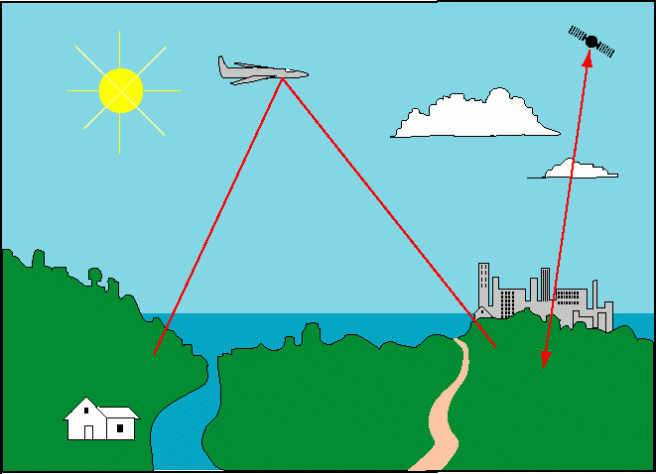
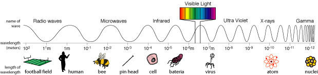
The hyperspectral data was collected using a sensor that was mounted on a NASA airplane. The angular cone of visibility detected by a sensor at a given time is called the Instantaneous Field of View (IFOV). The size of the IFOV determines the resolution or minimum size of a pixel.

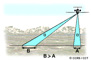
In this image from Natural Resources Canada, area A is the IFOV and area B is the area on Earth’s surface that that can be seen at a given time (B=A*C).

IFOV2

Area B, the area that can be sensed at any time, depends on many factors, including the altitude of the plane and the angle of the sensor. This illustration from Natural Resources Canada illustrates the effect of angle of view.

IFOV 1


During the August 17 data collection flight, the part of the sensors internal navigation system that measures the plane’s attitude or angle failed. This meant that we could not determine pixel size. It also meant that location data was not available for the hyperspectral data.

GIS stands for Geographic Information Systems. The term “geographic” refers to location.  Without geographic coordinates, we could not accurately place our data on a map. What could we do?

Normally, one would georectify the data using by lining up ground control points. Ground control points are known locations on the ground. they must be small, unchanging and easy to recognize. But, how do you find ground control points in a picture of water?

YK6

Fortunately, we had a .kml file of the flight path, which listed geographic coordinates and times, and a few images with features other than water like this image with a large Navy dock.

20150817_YK7

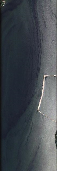
We were able to use measurements of the dock to calculate pixel size. We calculated the pixels to be about 2 meters long (a long track) and 3 meters wide (across track).

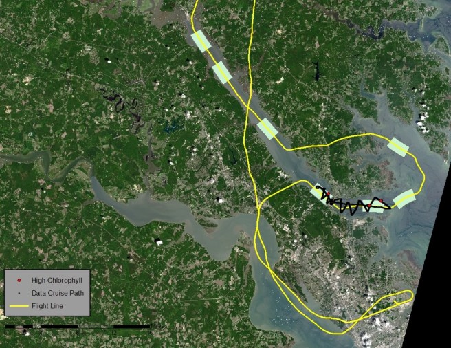
Dr. Kenton Ross, the national science adviser for NASA DEVELOP,  was also able to use time signatures from the flight path file to determine where the plane was at a given time. He matched these times to the time variable of the hyperspectral images and was able to estimate approximate geographic coordinates for each of the images. The seven hyperspectral image sites for the York River are shown below.

Path

However, I still had to give up a big part of my project design. When planning the project, I had forgotten one very important fact: water flows. Unlike ground control points, water does not stay in place over time.

On the image above, you can see a black squiggle. This is the path of the data flow cruise. It overlaps two  of the hyperspectral images shown above in space. However, since the chlorophyll samples were not collected at the exact same time (although it was within a few hours) as the hyperspectral images, the two data sets do not overlap in time. Because there is a time difference, the water moved. This might not make a big difference at 30 meter resolution, but at 2 to 3 meters, it could be a big deal.

There was another problem. The shape file with the locations lost its headers during processing. The ASCII file had to be edited in order to move the locations into ENVI.

Stay tuned for the final post of this series, Harmful Algal Blooms, Part 6, to learn how I (hopefully) resolve these issues and finish my project.

Harmful Algal Blooms – Part 4: What is a Spectral Signature?

The human eye is a light sensor. We can see because the objects around us emit or reflect light at wavelengths that our eyes can detect.

Remote sensing detectors work in the same way. Sunlight is reflected from Earth’s surface. Satellite sensors detect that light and create images. But, satellite and aerial sensors are a lot more sensitive than our eyes.

69904main_RemoteSnsg-fig2

Our eyes can only detect light with wavelengths from about 390 nanometers to 700 nanometers. This range is called visible light and is shown as a rainbow in the NASA image below. But, satellites can detect a much wider range of wavelengths, depending on the sensor. Landsat satellites detect light from visible blue (450 nm)  to the thermal infrared (1251 nm).ems_length_final

All objects reflect, absorb and transmit light. But, some types of materials reflect and absorb certain wavelengths of light in very characteristic ways. So, these types of materials can be distinguished from each other based on the differences in reflectance, or the differences in the pattern of wavelengths that are detected by the sensor. The pattern is called a spectral signature. The following image from NASA shows spectral signatures for some common Earth materials.

(If you click on the picture, it will take you to a NASA site that explains light and remote sensing in more detail.)

spectral-signatures.png

Harmful algal blooms also have spectral signatures. This is the spectral signature of Cochlodinium polykrikoides, one of the species that causes HABs in Virginia (Simon and Shanmugam, 2012).

Cochlodinium

C. polykrikoides is known to absorb light at 555 nanometers and reflect it at 678 nanometers.  These wavelengths correspond to the high and low peaks in the image above.

There is a lot of research about C. polykrikoides, but very little is known about the spectral signature of Alexandrium monilatum. I decided that I would use the hyperspectral data that was collected on our Golden Day of Data Collection, August 17, 2015 to identify blooms of C. polykrikoides and I would try to decode the spectral signature of Alexandrium blooms.

I had a plan. I would map the chlorophyll measurements from the data cruises on the Landsat image to identify the areas with the most chlorophyll. I believed this would correspond to the blooms. I would join these areas to the hyperspectral images in order to obtain spectral signatures. Then, I could map the extent of each bloom.

It was a plan, but you know they say about plans….

Stay tuned for Harmful Algal Blooms Part 5: Trouble in Data Land.


Harmful Algal Blooms – Part 3: A Golden Day of Data Collection

In my post, Harmful Algal Blooms – Part 2, I wrote about the challenges involved in monitoring harmful algal blooms (HABs). I also wrote about working with NASA DEVELOP last summer to develop a method to track harmful algal blooms using remote sensing data. We hoped to develop a tool that would allow HAB researchers to quickly identify algal hotspots.

One of our big challenges was finding dates for which there was both good satellite data and good ground data. We found one such date, July 3, in 2013.

Why only one day? NASA’s MODIS Aqua satellite monitors the Chesapeake Bay on a daily basis. But, Landsat covers the area only once every 16 days. If that day is cloudy, there might be very little overlap between the Landsat and MODIS Aqua images.

Here is a Landsat true color image for Path 13, Row 34 for June 17, 2013 downloaded from USGS’s EarthExplorer website:

LC80140342013168LGN00.jpg

Here is the MODIS image for the same day:

June17

As you can see, having plenty of satellite imagery doesn’t mean that we have good data about conditions in the Chesapeake Bay. And, unfortunately this happens a lot. What we really needed to  complete our project was a Golden Day: a day with clear skies where there was a boat cruise and Landsat coverage in addition to daily MODIS Aqua data. A Golden Day like that would allow us to verify the model.

The “Golden Day of Data Collection” occurred on August 17, 2015. On that day, there was a large bloom of Alexandrium monilatum in the York River and a possible bloom of Cochlodinium polykrikoides on the James River. As Landsat 8 passed above the Alexandrium bloom, the Virginia Institute of Marine Science used a boat to monitor chlorophyll in the water.  You can see the boat path (red squiggle) on the Landsat image below.  StudyArea

The MODIS Aqua imagery for the same day shows high levels of Chlorophyll in the Chesapeake Bay and its tributaries:

Aug17

Since our term with DEVELOP was over, the “Golden Day of Data Collection” didn’t help our project. However, the new team received plenty of information to verify our work. You can learn about their work  here.

Hyperspectral Data

But, the story doesn’t end with good verification data. One of my frustrations with working with Landsat data was that Landsat 8 is multispectral. It’s sensors measure 11 bands of reflectance ranging from 0.43 to 12.51 micrometers. But, these are wide bands and many species of bioluminescent phytoplankton like Alexandrium monilatum and Cochlodinium polykrikoides emit, absorb, and reflect light in very narrow ranges of  wavelengths.

While multispectral sensor bands are wide, hyperspectral sensors divide the same range of wavelengths into dozens, hundreds or even thousands of much thinner slices or bands. This image from Wikipedia explains the concept visually:

MultispectralComparedToHyperspectral

On the Golden Day, a NASA test flight equipped with a hyperspectral sensor passed overhead and obtained hyperspectral imagery of the area. The sensor was able to measure 283 bands of reflectance ranging from .35 to 10.50 micrometers. This means that the sensor could measure the very specific wavelengths I was interested in.

The true color images look like this:

YK6


A pixel in this image is about 2 meters by 3 meters.

Because the images show water from a high altitude, they aren’t at all very exciting too look at. However, having this type data  was very exciting to me. I volunteered to work with the hyperspectral data during the fall term. This work is my project for GIS 255 and GIS 295 and I will describe my project (and the frustrations of working with the hyperspectral data) in future posts.

Go to: Harmful Algal Blooms, Part 4: What is a Spectral Signature?

Harmful Algal Blooms – Part 2: Monitoring Harmful Algal Blooms

In Harmful Algal Blooms – Part 1, I discussed what a harmful algal bloom is and why we care about blooms.  I wrote about the dangers that HABs pose to public health and the economy and explained why it is important to monitor and study HABs.

Members of the Virginia Harmful Algal Bloom Task Force use a combination of fixed stations, continuous sampling, and periodic dataflow cruises to monitor water quality in the Chesapeake Bay watershed. This map shows monitoring stations in Virginia.

Sorce: Virginia Institute of Marine Science

Data for each of these stations is available at the Virginia Estuarine and Coastal Observing System (VECOS) website.  It looks as if Virginia’s rivers are well-covered, but if you go to the site and take a look at this data, you will notice that many of these sites are no longer active due to funding cuts.

Current monitoring consists of fixed stations and periodic dataflow cruises operated by the Virginia Institute of Marine Science and Old Dominion University. Most of this monitoring focuses on the James River and the York River. Sanitation districts, like the Hampton Roads Sanitation District, do automated continuous sampling in their service areas. This monitoring is on-going, but it doesn’t provide a complete picture of HAB activity.

The first obstacle is that processing all these samples takes time. Harmful algal bloom species have to be separated out of water samples that contain hundreds or thousands of other microorganisms through a complex series of DNA tests. Information isn’t available until weeks or months after a bloom occurs. By then, it may be too late to determine what factors contributed to the bloom.

The second problem is that using dataflow cruises for real-time monitoring is expensive. So, boat cruises are restricted to areas of high concern. This means that blooms in other parts of the Chesapeake Bay watershed may be overlooked.

This makes it difficult to get the environmental and water quality information needed to understand and predict HAB occurrences. It also makes it difficult to get real time information about HAB activity in the Chesapeake Bay watershed.

What if there was a less expensive option?

Last summer, I participated in the NASA DEVELOP program at the Patrick Henry Building in Richmond. Our team, Cassandra Morgan and I, worked on a method to monitor harmful algal blooms using satellite data.

Sara Lubkin (NASA DEVELOP), Todd Egerton (ODU), Wolfgang Vgelbein (VIMS), Kimberly Reece (VIMS), Cassandra Morgan (NASA DEVELOP)

Satellites can take pictures of HABs like this Landsat 8 true color image.

study_area_81715
Landsat 8 08/17/2015

While, you can see the bloom in this picture, it’s hard to determine exactly which areas are in the bloom. However, phytoplankton uses chlorophyll-A to harvest the energy of the sun. VIMS and ODU detect harmful algal blooms by measuring levels of chlorophyll-A. What if we could detect chlorophyll-A in the water using remote sensing? We could then use chlorophyll measurements as a proxy for HABs.

NASA’s MODIS Aqua satellite collects information about water, including chlorophyll-A levels. Chlorophyll-A maps are available at no charge from NOAA CoastWatch’s East Coast Node.

This is a MODIS chlorophyll map for the same day.MODIS

You can see that there are high levels of chlorophyll in the James River, Upper Chesapeake, Potomac and Mobjack Bay.

The problem is that MODIs aqua chlorophyll products have a 1.4 kilometer resolution. So, they don’t give a lot of detail – especially in narrow rivers like the York.

Landsat 8 has a 30 meter resolution. But, there are no publicly available Landsat chlorophyll-A products. It was Cassandra and my job to create this product.

We started by  downloading Landsat 8 images (Path 14, Row 34) from May through September 2011-2014. We looked for images without too much cloud cover. We masked out the land and the clouds and  filtered these images through a 1.4 km moving window to match the MODIS resolution. We chose the day with the best overlap between MODIS and Landsat and joined MODIS the chlorophyll-a values to each smoothed, masked Landsat band. We also added bathymetric measurements

Once we had this data in one table, we were able to export it to “R” and run a series of regressions. We tested 78 separate equations. The best five equations were used to create tools using ArcGIS model builder (r-squared values .57 to .62). Here is an image of chlorophyll in the Bay created with one of those tools.ChlJuly3

We were now able to show chlorophyll-A estimates at 30 meter resolution.

Cassandra and I created a preliminary model for chlorophyll-A during our summer term. This term, NASA DEVOLOP teams at Langley Research Center and Wise County are testing the model on additional dates and validating the equations using VECOS water quality data. They are also creating easy-to-use ArcGIS tools that will allow VIMS and ODU to quickly assess the extent of algal blooms in the Chesapeake Bay.

These tools will save time and money by allowing VIMS and ODU to better target their monitoring efforts. The tools will also allow researchers to collect information about environmental factors associated with HABs.

To learn more about NASA DEVELOP and this project, check out our video or our story map.

Next Week: Harmful Algal Blooms – Part 3: The Golden Day of Data Collection